Information Design and Typography

[I got asked yesterday by a student in another university “what Information Design (and especially Typography) means to you”, and dumped this out over breakfast; I post it “as is” to avoid going into the black hole of perpetual editing.]


Firstly, typography: this depends on the institutional viewpoint, and the language*. In the English-speaknig world it is a continuum. At one end it refers to the the design of texts at the paragraph level, covering type choice, line measurements, and similar micro-typographic choices. At the other end typography encompasses all choices relating to the construction of a document as a carrier of information that readers engage with because they want or need this information. The critical distinction lies in the engagement with the text: typography, in its wider definition, covers a range of macro choices at the level of the spread, the document as a sequential experience, and the production of a physical or on-screen object.

Information Design covers typographic design where the engagement of the readers with the text is critical and has specific objectives. Navigation (wayfinding, way-showing, route-mapping, and any of a number of similar terms), safety, instruction, and training are the most common applications. At the heart of Information Design is a user-based perspective, and the imperative to test design solutions. As design scenarios migrate to screen-based environments, especially mobile devices, the potential for customisation of information design to each user is increasingly important in its methodology.

My view is that “static” Information Design on fixed substrates (paper, vinyl sheets, plexiglass signs, and so on) is fundamentally different from Information Design on digital environments. In the first case, it strives to maximise the efficiency of the message and eliminate ambiguity for the largest section of the intended audience. In the second, it has the additional function of maximising the value of the information to the specific demands of the user. This is an additional motivation for the reader to engage with the document, and a much more interesting challenge for the designer. Customised paper documents (e.g. utility bills) have tried to bridge the gap between these two poles, with some success, although clearly they will rapidly give way to screen-based versions.

Of course, in all cases Information Design has to carry the identity of the publisher. This is in itself a separate design challenge, usually addressed by aggregating the effect of the designed objects rather than an individual document. For example, a sign system brands a building through the consistency of its appearance, just as much as by the range of the scenarios it enables.


  • In Spanish-speaking countries “tipografia” means “type design”. This, as you can imagine, leads to no end of confusions and clarifications.
Sans serif options

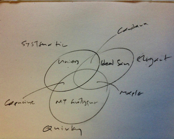
An impromptu Venn diagram to help explain a point about styles for a sans serif student project, from earlier today.

The three circles are Systematic / Elegant / Quirky. The typefaces fully in each are Univers, Ideal Sans, and MT Grotesque. The Systematic/Elegant one is Candara, the Systematic/Quirky is Capucine, and the Quirky/Elegant is Maple. Nothing in the centre.

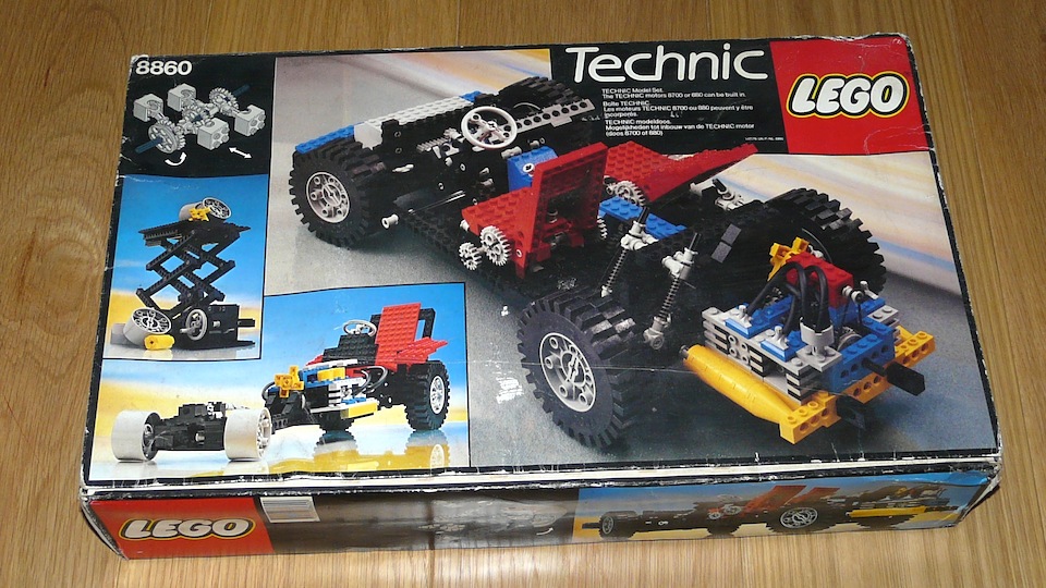
Lego Technic 8860

My father used to travel frequently for business. One airport welcome, when I was twelve, I remember most vividly: on the luggage trolley was a brand new Technic 8860, the biggest, most complicated model you could get your hands on. This was 1980, and at that time in Greece Lego Technic – let alone the big, kick-ass models like this one – were pretty much unobtainable. I fed its pieces to my imagination for years to come.

My childhood Lego is half a continent away, for son and nephews to share, so a gazillion new models found a home here. But aunt eBay called, (she had a few oldies floating around), and I’m not sure the new models have shifting gears and a differential transmission…

The perfect tool

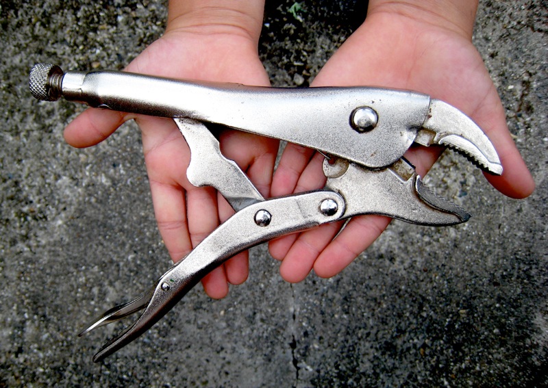
A vise grip

A few days ago a series of coincidences starting with an email about recent work brought me to MB’s drawing about her dad. I was reminded of feelings for my father, a naval engineer for half of his career. He enrolled at the naval academy at the inconceivable age of fourteen (the youngest cadet ever, if family myth is true) and spent the next twenty-five years in and out of the bowels of ships: from wooden torpedo boats to hand-me-down US Navy destroyers, all the way to enormous crude tankers in Japanese shipyards. As much as he could, he exposed me to this world of wonderful machines, making me the only boy in my school who had seen where a propeller shaft exits the hull from the inside of the ship, or heard the deafening clanging of a tanker engine at full ahead (sound so thickly enveloping you that felt like water flowing around you in the sea).

The engineering background brought a garage full of too many tools (no, wrong: you can never have too many tools) and a facility with making and fixing things. I inherited the enthusiasm and some of the skills. I can now appreciate that a confidence to tackle anything I can figure out by looking at how it works and thinking it through, is one of the most valuable things I got from him. (Which also explains my failings with electronics: I can’t look at them work, nor take them apart and lay them on the table.)

In all the years of my tinkering, from toy models to motorcycles and a much-suffering Citroen 2CV, one tool has been my favourite. I’ve got no idea what it’s name is in English,[1. I now know: vise-grips] but in Greek it’s called μποζονοβγάλτης – bozonovgáltis – essentially a tool to loosen nuts. It has an adjustable grip, from a few hairs’ wide to easily six centimetres wide, and once locked onto an object it will grip as strongly as if you had run a bolt through the thing. Its force of grip is such that you can loosen a locknut by gripping two opposing sides with less wear on the nut than a spanner will inflict.

Yet the reach of the handle will always be at the optimum for your hand, and a simple push on the small lever will release the tool. You can use the rear side to bash things loose – or even drive a nail in – and the lever action makes the cutter slice through the thickest cable or rod with little effort.

When we bought our house, it was the first tool I bought. Now, in my oldest son’s hands, I hope it will feed his and his brother’s desire to take things apart and put them back together again.