Countdown!

Gerard Unger on national trends in typeface design

Only a couple of weeks to go!

We planned the TDi course as a complete short course on typeface design, not [just] an introduction to the subject or a tutorial on software. We started by cramming the best elements of the full-blown MATD programme, then cranked the staff-student ratio to a level closer to private tuition than class-based learning. We have a lot of flexibility to customise what we deliver to fit each participant’s interests, and structure sessions on active learning principles; this means we get you to ask the questions, and find the answers through guided research.

We focus on type, but from a wider, typographically rich perspective. We consider the documents typefaces are used to typeset, the technologies used for typesetting or rendering, the user conditions for reading, and the historical and cultural context of their development and use. For example, if we are discussing the optimal texture for reading paragraphs with a Latin typeface, we don’t just tell people ‘this or that proportion or pattern’. Instead, we start by looking at a table-full of material that spans time and genre (from some Estienne books from the 1570s, to Modern books from the late 1700s, to some 19C publicity, to a range of 20C material, to articles parsed on Instapaper on an iPad. We then guide the group’s observations until people arrive themselves at valid conclusions. We use this approach especially strongly in our sessions for non-Latin scripts, when developing an understanding of how the script works is essential. For that we discuss (and try out) tools, and examine a lot of archival material that sheds light on why some scripts have the forms they do, today.

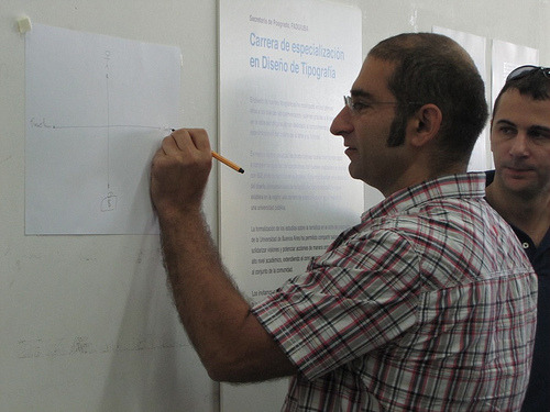
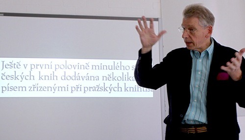
The days of the first week are full of alternating practical sessions, and hands-on seminars, often in groups of two or three students per staff member. We make Fiona Ross, Gerard Unger, and Gerry Leonidas (the three main contributors to the MATD) available all week, all the time, and bring in a number of additional contributors for specific sessions. The practicals are both in group crits (on the wall) and one-to-one. We have a few evening lectures in the first week, usually to round off the day’s teaching, shared by Gerard Unger and Gerry Leonidas. A typical day starts with the cohort having a common session, then splitting for smaller group sessions, then reconvene. The small group sizes allow us to run the tutorials and seminars very informally, and trust people to experience material from our collections and archives intimately. From incunables, to original type drawings, and from Otl Aicher’s original posters for the Munich Olympics to a full run of Octavo and Emigre issues, participants have unprecedented access to typographic treasures. (It is difficult to describe the impact on a designer contemplating the forms of their italic of being presented with Giovannantonio Tagliente’s original writing manual. At the same time, we can answer questions about the current state of typeface design in a range of areas, with our own work and case-studies of flagship OEM projects. By the end of the first week, we aim to have helped participants develop a deep understanding of typeface design, a solid set of skills for type development, and a good research-based process for expanding your knowledge and practice in new areas.

The second week takes these foundations, and focuses on developing the practical work started in the first week, guided more by the objectives set by the student for their own project. (Often people come with a specific typeface to work on, or a script they want to build experience in, and so on.)

Most of the participants are international: the past three years saw people from 21 different countries coming to Reading. A small number coming during or after their MA courses in other institutions, or to help with type-related PhDs. Most are mature professionals, designers and typographers, or educators.

Full details in the PDF on this page.

p.s. We’ve got two places left for this year’s course. Get in touch if you’re interested.

Od „Ala Ma Kota” Do E-Matury slides

These are the slides from my presentation at the Od „Ala Ma Kota” Do E-Matury conference in Warsaw, on 18 April 2012. The talks were 16 minutes long, so this is a fairly condensed deck. As always, my slides are starting points for each idea; there’s about a minute’s worth of elaboration for the key ones. I’ve been asked to write the talk up, and I’ll link to that when it goes public.

Ala Ma Kota conference slide 1
“It’s typography, Jim, but not as we know it…”

Six observations, four challenges, one conclusion, and five predictions…

Ala Ma Kota conference slide 2
Observations
Ala Ma Kota conference slide 3
People run out of time faster than they run out of options
Ala Ma Kota conference slide 4
There’s no such thing as “new media”, only new users
Ala Ma Kota conference slide 5
Internationalisation and geography matter
Ala Ma Kota conference slide 6
The permanent and ephemeral are reversed
Ala Ma Kota conference slide 7
Materials become precious
Ala Ma Kota conference slide 8
The market does not wait for teachers to write lesson plans
Ala Ma Kota conference slide 9
Physical properties are no help in predicting potential uses
Ala Ma Kota conference slide 10
Challenges for designers
Ala Ma Kota conference slide 11
Support for text and typography is not Good Enough
Ala Ma Kota conference slide 12
Support for text and typography is not Good Enough
Ala Ma Kota conference slide 13
Typographers lose the reassurance of familiar, visible, tactile structures
Ala Ma Kota conference slide 14
(A conventional structure is defined by spreads and sequence in the bound object)
Ala Ma Kota conference slide 15
(An e-publication’s structure relies on content sections…)
Ala Ma Kota conference slide 16
(…which are not differentiated without reference to external navigation)
Ala Ma Kota conference slide 17
(…and therefore rely on the root-level navigation for the publication to explain itself)
Ala Ma Kota conference slide 18
We lack great models for integrating inline and immersive content
Ala Ma Kota conference slide 19
Texts are becoming nodes in networks, but typography has been volume-bound 
Ala Ma Kota conference slide 20
(A single of the sections we identified has four aspects that traditional typography has no solution for:) 
Ala Ma Kota conference slide 21
(links within the text to other texts,)
Ala Ma Kota conference slide 22
(annotations by the user,)
Ala Ma Kota conference slide 23
(annotations by other users,)
Ala Ma Kota conference slide 24
(and links within the annotations.)
Ala Ma Kota conference slide 25
(Developments in literature, which is easy to parse, show some ways forward) 
Ala Ma Kota conference slide 26
(uncovering meaningful connections in the text)
Ala Ma Kota conference slide 27
Conclusion
Ala Ma Kota conference slide 28
This emerging typography is traditional at the paragraph level, and potentially innovative at the semantic level 
Ala Ma Kota conference slide 29
Predictions 
Ala Ma Kota conference slide 30
Three to five years of conservative solutions: just ‘digital books’
Ala Ma Kota conference slide 31
Local interfaces will adopt traditional solutions
Ala Ma Kota conference slide 32
Personal aggregators will threaten traditional authorship models
Ala Ma Kota conference slide 33
Knowledge platforms will push beyond ‘digital books’ when trust systems mature
Ala Ma Kota conference slide 34
Authors, publishers, and students will continue to adapt much faster than teachers (and schools, and education authorities)
Ala Ma Kota conference slide 35
Thank you


Explaining typeface design

This morning Fiona, Peter Bil’ak and I visited the UBA to see some of the work of the postgraduates on the UBA course (see the Typography at Reading blog). One of Henrique Nardi’s images captured me sketching an aide memoire for the session, which is worth linking to here to have handy for the sessions next week.

The axes describe a simple framework for talking about typeface design projects. At the top of the diagram is the Designer, and at the bottom the brief (and the client, who represent the requirements of the users). The left of the horizontal axis represents the Functional requirements in the project, and to the right the expression of individuality and Identity through the design of the typeface.

Gerard Unger gets the SoTA award

Yesterday evening Gerard Unger was deservedly awarded the S[o]TA Award, and joins an illustrious group of previous recipients. I had the pleasure of following John Downer and Juliet Shen with a few words. He later asked me if I’d written it down, and I responded that I only had headings noted:

notes on GU's award

Not possible to read, so here’s an exact transcription; some day I’ll have to write this up:
— Why?

— Excellence in design practice
* Longevity (40)
* Identity
* Integrity — work founded on deep engagement
* Establishment of a genre [even in Dutch environment
* Contribution to our innate sense of “rightness”

— Teaching
* Rietveld, __Rdg__, Leiden
* immersion in st[u]d[ent] processes
* openness
* sharing
* absence of ego

— Writing
* engaging with discourse
* strong inv[olvement] w[ith] how we read
* defining the field [of typeface design]
* leaving texts for reflect[ion]
I realize these notes don’t make much sense, but they give the outline of my thoughts yesterday.