Interview by the Type Journal (2014)

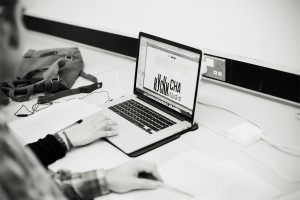
Журнал «Шрифт»In the summer of 2013 Alexei Vanyashin asked for an interview for the (then still to-be-launched) online journal «Шрифт». The questions ended up being the most comprehensive set I had ever responded to. Over several weeks Eugene Yukechev (the editor) followed up with additional questions and clarifications, to make sure that my points were clear. It is rare to have the space to go deeper in an interview, and this one was a pleasure to do — for this reason, and for the professionalism of the editorial team. It is also a pleasure to see that Evgenia Basyrova‘s photographs captured the atmosphere in the Department. 

Below are my original responses in English, which formed the basis for the final text.

Журнал «Шрифт» Have there been any changes in the Reading MA Typeface Design programme over the last five years?

The programme changes every year. There are external factors (where we perceive the industry moving towards, and the direction in which we want to grow) and internal (the interests and personalities of the students, and the mix of the visiting staff).


Журнал «Шрифт» What are the highlights of the MA Typeface Design programme? What major skills and competencies are students expected to build?

The MATD is founded on the idea that typeface design exists at the junction of design practice, a historical and technological environment, and a cultural context. So, alongside designing typeforms, and specifying typefaces, our students dive deeply into historical, cultural, and technical research. Achieving a high level of practical skills comes with building a deeper understanding of how typefaces meet specific demands in a range of cultures. And, above all, is probably the change in the way of thinking about design, and your own practice. Graduates learn to think more critically about their discipline, and question the design decisions they make – not just for the typeface they work on while at Reading, but long after. Highlights would include regular workshops on scripts, seminar series from Michael Twyman and lectures from James Mosley, the annual field trip, as well as deeply personal moments of discovery and insight.


Журнал «Шрифт» The MA Typeface Design programme is known for developing multi-script typography skills — would you say this is market demand driven or an educational method?

Both, and then one more thing. Firstly, we are tracking the growth in demand for multi-script design skills in the type market. This is well recognised and indeed still growing from “mainstream” scripts (like Arabic and Devanagari) to scripts for smaller communities (like Khmer or Burmese). Secondly, we use designing for a wide range of scripts as a way to build better design skills: a deeper understanding of the relationship of written and typographic forms, and the developing conditions in global typography. And, thirdly, we use work in this area to develop research skills, the experience of working with archival resources and field work, and the construction of arguments.

We have developed a methodology that shows how the technological, corporate, and cultural environments in which typefaces are made have influenced the interpretation of the original, underlying scripts. Our method of typeface development takes into account the growth of non-Latin typeface design as an industrial enterprise in pre-digital and digital environments; the impact of type-making and typesetting technologies on the form of individual characters the typographic decisions in document design that reflect changes in type-making and typesetting environments; and the tension between tradition and modernity in contemporaneous visual communication. Once understood for the scripts each student is working on, this methodology can be applied to any script.


Журнал «Шрифт» At TypoBerlin 13 Erik Spiekermann expressed his disregards to Cyrillic. What is your take on Cyrillic? In regards to Latin and Greek, is it an alien script?

I do not know what context this was said in, so can’t guess what Erik meant, you’d have to ask him to clarify. My own interest in Cyrillic is from the point of view of a script shared by different cultures that seek to express a typographic identity, of communities of designers with very different backgrounds, and as an example of a script with a constantly developing typographic repertoire.
From a design point of view, I think that the three european scripts are a superb lesson in developing consistent typographic identities from very different fundamentals. In the Cyrillic, you have a degree of intentional form-making, and a combination of elements that require a deep understanding of the script structure, with a very specific history of adaptation to historical models. In the Latin you have a very high degree of formal uniformity and a grammar that allows the widest range of configurations, but a fairly narrow scope for innovation. This, in my view, makes it possible to achieve moderately successful (and slightly boring) designs easily, but makes innovation more difficult. Greek is at the other end of the scale, like an unconnected-Arabic: it has eastern scribal roots, a single writing style at its roots, and is based around counters and loops, rather than strokes. Put all three together, and you’ve got a superb lesson in typeface design.


Журнал «Шрифт» Is it often for students to express their willingness to design a Cyrillic? How do you find the overall level of Cyrillic in the MA projects?

I would say that there is only a moderate desire to cover Cyrillic. If I had to speculate why, I’d say that the relatively healthy production of typefaces from Russia and Serbia, and increasingly Bulgaria (possibly other places, too) makes Cyrillic less of a challenge in research terms. As for the work of MATD graduates in Cyrillic, I do not think I have the expertise to voice my opinion. When a student wants to cover Cyrillic I am primarily interested in how they propose to build the right skills themselves: you want a student to have a solid research-based approach, and to build a methodology that will allow them to build skills for any script.


Журнал «Шрифт» The Reading programme, as opposed to t]m, includes a large analytical research. What are its benefits?

In this Reading is not only different to the KABK, but to any course that is situated in an art school. All the courses in the Typography Department at Reading are informed by us being part of a research-intensive university (and, indeed, a very highly-rated one). Typefaces do not exist in a vacuum: they take form and meaning because they are responses to many other typefaces that exist already, and to changing conditions of use. Good research skills, and a sufficient understanding of typographic history and practice, are essential.
For example, how can a Russian designer create a good typeface for the Latin script, or Greek, or indeed anything else – and vice versa? Surely just being able to read the language is not enough, otherwise any graphic designer who can move a Bezier curve would be a good typeface designer. Apart from the skill of working with details that combine to create a typographic texture, a typeface designer can engage with what’s appropriate for a document type, and for specific uses: this is all pretty basic stuff, but it is based on research. And innovation requires a deeper understanding of what it is you are innovating against: what is the common position that you are re-thinking?


Журнал «Шрифт» Do you consult students on their Cyrillic? What is the hardest part in consulting on Cyrillic?

We try to support the scripts the students do, with regular feedback by relevant experts. Cyrillic has been one of the most difficult to find good support for, partly because of the very small number of suitable experts who are resident in the UK, or permitted to work here. The way we teach requires repeated contact, which is even more difficult. Unfortunately the costs and visa situation looks like it will get worse before it gets better.


Журнал «Шрифт» What are your preferences in typographic conferences and events?

I have a soft spot for ATypI, and enjoy hugely TypeCon. I also try to attend as many of the one-day and evening events at St Bride as I can (my favourite location for type gatherings in the UK). There is an increasing number of UK events that make it very difficult (and expensive) to keep up: TypoCircle, TypoLondon etc., Point, events in Birmingham, and many more. I am also very happy when I can attend smaller events like TypeTalks, where there is an opportunity to meet many people. In recent years I have been talking at events that are not targeted at typographers and typeface designers (like the tightly-focused Ampersand) that require me to think more deeply what is relevant from typeface design to other fields. My second-favourite events outside the UK are in Poland, which I find buzzing with activity. And my top-of-the-list is the triennial ICTVC, first in Thessaloniki, and recently in Cyprus, which brings together a very unique mix of specialists.


Журнал «Шрифт» What are the key discussion topics in the typographic world today?

There are three areas we are discussing intensely. Firstly, the globalisation of typography and typeface design. This means not only that wide script coverage, but also that designers think about wide type families, and typefaces that allow typographic differentiation in scripts that have not had a developed tradition for this. For example, starting with a script that until recently only had a low-modulation stroke, to develop a modulated display style will require a decision about the angle of stress and how it changes along the forms. There are many different possible implementations for this, and the structure of the letters does not give obvious answers. Conversely, removing the contrast from a heavily modulated style may distort the letterform in unacceptable ways. These are hugely exciting areas, of intense innovation.

Secondly, some areas of typography are changing rapidly, mostly due to the rethinking of what “document” mean in a world of smaller, user-responsive devices. In this environment the typefaces and the typography at the paragraph level become a key identity identifier.

Thirdly, we are seeing typography and typeface design maturing into a recognised discipline, with its own established literature, numerous education pathways, and a growing understanding of its importance by the wider public.
These three areas make working in typeface design and typography today more exciting than ever.


Журнал «Шрифт» What is your take on the phenomena of the ever-growing Monotype Foundry?

I think this discussion is a distraction. The current Monotype company will never have a hold on the document-making industry like the two main companies did in hot-metal years. The type business is growing rapidly (witness the rapid growth of small- and medium companies, like Type-Together, HFJ, and DaltonMaag). There are, however, two very interesting aspects in Monotype’s activity: one is their rediscovery of the importance of their historical know-how, and the other is their move into the area of online documents, with Typecast – the most exciting new company, from my perspective.


Журнал «Шрифт» What is the most important skill, a student must learn on the MA course?

To ask questions! To think critically about the forms they make, and the typographic world around them.


Журнал «Шрифт» Maxim Zhukov considers you the best type design educator in the world today. What do you think is the key ingredient of this success? What should a successful teacher be?

Yikes! This is an embarrassingly generous compliment, Maxim is very kind. I think a good teacher tries to give the student what they need, and also push them a little bit outside their comfort zone, while being sensitive that each person needs different challenges. I try to do this, but I am sure there are graduates who hate my guts.


Журнал «Шрифт» How would you describe the role of Gerard Unger on the course, how many hours does he spent with students?

Gerard is as central to the MATD as Fiona and myself are. He visits six times a year, for four days each time. He covers a wide range of topics, and is instrumental in shaking things up. He does not let students be satisfied with something just good enough, and keeps pushing them. He also exceptionally patient and insightful when students are looking for inspiration. Gerard also contributes with many lectures, and looks after half of our field trip. I think that we have a very good balance of influence, and complement each other well. And we are good friends.


Журнал «Шрифт» Are there any new guest lecturers on the course? Who was visited Reading with a lecture recently? What topics are are of interest to the students?

Many visitors contribute each year, in addition to Michael Twyman’s twenty seminars, James Mosley’s similar number of lectures, and Victor Gaultney’s six all-day visits. This year we’ve had people doing workshops (e.g. Wayne Hart for two days on stonecutting, and Martin Andrews on letterpress); visiting speakers like Richard Grasby, John Hudson, Paul Barnes, and Myra Thiessen; and people running multi-day sessions, like Tom Grace, David Březina, and Miguel Sousa. We also have speakers for all our MA programmes in common, like David Pearson and Lawrence Penney; and about a dozen PhD researchers presenting their work.


Журнал «Шрифт» What makes a successful student project?

The student projects are primarily learning tools: the best projects help the students become great typeface designers, able to do exceptional typefaces after they leave Reading, and be great collaborators. If the typefaces get published and have a commercial life of their own, then that’s a bonus.
There also students who do not go into type design; for them the projects are learning experiences of a different kind, and there you need to focus the project on what would benefit the student more. We’ve have people who come to Reading with, say, ten years of software engineering experience, or twenty years of book design experience. In such cases the objectives are tailored to what would give those students a steep learning curve, a good challenge that is relevant for their career.
And, in all cases, you want the graduates to leave with a love for typography and typeface design, and with an open mind for themselves and their discipline.


Журнал «Шрифт» On your recent TypoBerlin talk you mentioned that there is an increasing number of Reading students from Germany. Is Germany in your opinion more typographically active than other countries? Or could you say the interest in typography is decreasing in the UK?

We have always had strong interest in the course from Germany, and it does seem to have increased in recent years. Germany is a unique market in Europe: it is not only mature typographically, but also large enough to sustain its internal typographic education and publishing industry with no need to translate native texts, or seek to sell in other countries. At TypoBerlin I was teasing the audience a bit, so I will rephrase my question as: “in a saturated market, how can a young designer distinguish themselves?” This is, to a growing degree, a challenge for new designers in many other countries.
As for the UK, I do not think interest is decreasing at all; on the contrary, it is growing; we see this at Bachelors, Masters, and PhD levels. But the UK market is different: it is very international in exporting skills and services, as well as in receiving talented professionals form other countries. In the creative industries, London is by far the most international city in Europe: although cities like Berlin attract a lot of self-employed designers (mostly due to the lower cost of living) it is London that has the business turnover.


Журнал «Шрифт» The technological aspect of the production of type design over the last ten years has greatly improved(evolved). Nowadays a good type designer is often a good programmer. How did this affect teaching type design, how has the practical methodology changed?

The expectations from type designers on the technical level have increased in recent years, but gradually, and not fundamentally: there’s more to learn, and some stuff may seem more complex, but nothing is prohibitive for entry in the profession: you don’t need a degree in computing. This means that a motivated graphic designer can easily pick up the training to shift to type design. This is similar to designers having to learn to work in proprietary markup languages, SGML, XML, and so on: nothing new. The intensity of the comments on this is more revealing of the short memories of the commentators, rather than any deeper shift. Type foundries are full of technically very competent people who learned through online resources, and short workshops. So, I think this is something of a non-issue: designers have always had to learn about the technology of their field, and it never was at university-level.

The real challenge, where there has been a fundamental change in type design, involve the expansion in skills into non-Latin scripts. The level of knowledge required there to produce competent designs is not within the realm of the self-educated. The research and interpretation skills that a new designer would need to tackle unfamiliar scripts are simply not possible to develop on your own. And, unfortunately, for many scripts we do not have yet widely available resources to support this. This area is leading the elevation of typeface design from a craft-based activity to a profession with a recognised body of knowledge and skills. We are still at the very beginning of this process, but in another ten years this will seem too obvious to mention.


Журнал «Шрифт» What are the career options of today’s Reading graduates?

Many are employed in type foundries (like DaltonMaag, Fontsmith, or Hoefler & Co). A good number work for Monotype, Adobe, and Microsoft. Quite a few work as individual freelancers, publishing through other foundries. And it is important to mention Type-Together and Rosetta Type, two foundries founded by graduates with considerable growth. About a third have some engagement with teaching – either full-time or part-time, and this is growing as graduates want to add variety to their careers. As type design schools grow in number, this will continue to rise. And about a third return to graphic design work while doing a bit of type design.


Журнал «Шрифт» Why do you think Russian type design students prefer Holland to England for their education? Is it merely a question of finances? 

You’d have to ask them, but my impression is that the financial difference is overwhelming for a Russian applicant. And because there is no framework for student loans or suitable scholarships, students rely on personal or family finances. This is just crazy, and discriminates heavily against people with talent.


Журнал «Шрифт» If you were to explain to a prospective student, how would you underline the main differences between Reading and KABK MA programmes?

You asked me a similar question already. Why compare with the KABK, and not Porto, or Elisava, or FADU-UBA, or Gestalt? In the recent exhibition of student work at the Ampersand conference there were well over thirty institutions represented. So, your question is misleading, as if there are only two places to study type design. Regardless: I advise applicants to visit the schools they consider: it is important to meet their tutors, ask questions about studying there, and get a feel for the place. Speaking with graduates is also important.

Now, specifically about the difference between Reading and the KABK: we are not an art school, but a university programme, in a department with a range of related programmes, and forty years of institutional experience of PhD and staff research in typography. Our student read and discuss at a high level, and conduct research in type design that is often ground-breaking. They work on typefaces that get them design jobs, and produce academic works that get them teaching jobs, and help other designers as well. When they graduate, they publish proper type specimens and dissertations that have weight and content, not ephemeral posters. These are our strengths. Worldwide, the trend in type design education is to emulate what we do.


Журнал «Шрифт» The inability to design non-latin fonts by non-native readers has been discussed at conferences. It turns out Reading MA programme counters this, providing an opportunity for designers to be involved in the multilingual typographic scene. Is that true?

This is, unsurprisingly, nothing new: this challenge is central to the history of typeface design, and grew rapidly in the second half of the 20th century. At Reading we have records of such discussions from the 1960s at least, as well as documents that show how people addressed the design problems of unfamiliar scripts. With Fiona Ross we have developed a methodology that builds on these earlier processes, and is based on a combination of research and script-specific practice. We start with the manual foundations of a script, with sensitivity to tools and substrates, and an analysis of writing practices. We correlate this with research into the type-making and typesetting technologies that influenced the typographic implementation of the script (for example, hot-metal technology imposed limitations in the character sets, the forms of individual letters, and the way forms combine, that do not apply to today; to reproduce these restrictions would be not only ignorant, but plain bad design). We then explore the way in which typeface design reflects the tension between tradition and modernity in visual communication, which is a key consideration in typeface design (for example, the associations with monoline strokes as “modern” or “traditional” are entirely relative to precedent and regional associations, not inherent in the shape itself). Finally, we investigate typeface design for complex typography within each script / language combination, by analysing past and current publications from that community. These considerations allow for a more nuanced development and testing environment, that allows talented designers to cover scripts they are unfamiliar with. While there is always a requirement for testing with native readers, this is much more towards the end of the development process than people tend to think.


Журнал «Шрифт» In your opinion, does it make practical sense to design Cyrillic without a having Greek extension? (Does designing Greek aid in working with Cyrillic?)

In the case that a project is driven by a client’s brief, the Greek many or many not be part of what the client is paying for, at least initially. Certainly for a pan-European market the Cyrillic may come first, but experience shows that big branding projects tend to “script creep”: the initial briefs get extended as the brand spreads to more regions. So, the designer may well add Greek after the Cyrillic is delivered. Another answer depends on the designer’s plans for building a library: there is a competitive advantage to script coverage, and — once you’ve got a Cyrillic or a Latin — the Greek is relatively easy to do compared to other non-Latins. Finally, there is the point I made elsewhere: designing Greek and Cyrillic for the same project is a good design challenge.


Журнал «Шрифт» Could you give us a list of ‘Gerry Leonidas recommends’ books that no type designer/typographer can live without?

This is a difficult question to answer without some limits on time, or some idea of the experience of the reader. There are fourteen key topics we discuss on the MATD, and I select texts for each depending on the ideas we want to discuss. In that sense, a book or article that is controversial might be more useful in the environment of a structured, guided discussion. But the same text might be misleading if someone reads it on their own without pointers. (I am slowly putting the lists for these seminars online.)

I also never include books like Robert Bringhurst’s Elements of typographic style, or Philip Meggs’ History of graphic design: titles like these are on every designer’s bookshelves, and to include them would repeat the obvious. And I don’t include some targeted titles (like Cyrus Highsmith’s very good Inside paragraphs, because I prefer to discuss spacing alongside Tracy and Dowding’s methods, as well as objects: a page of Didot and a screen of Instapaper with Nicole Dotin’s Elena selected.)

So, which texts? I’ve got a list for incoming MA students on the new Typeface Design site which I think is a pretty good starting point. It also includes some comments on magazines and blogs that form an essential part of a typographic designer’s horizon. I occasionally update the listing, but prefer to have items that have proven their value, rather than the latest title.
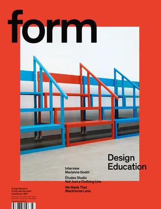


Form(al) education

form magazine cover

The re-issued form magazine dedicated an  issue to design education. Anja Neidhardt asked me four questions, as part of her research for her article. (The issue can be read on Isuu via the form website.) Here are my answers to Anja’s questions:


At Typo Berlin (if I remember right) you said about teaching: “What we do is: We cheat”. Please explain this statement.

The context for this sentence was a longer statement about the nature of typographic and typeface design. Typography happens in contrast with other areas of design, where the functional conditions are relatively simple and the space for formal experimentation relatively wide. In the typographic disciplines we look to past practice as a guide to the assumptions that users will make in each circumstance. This happens because the design objectives are relatively complex (the information density is high) and their configurations relatively stable (a news article has a similar structure on a print newspaper as on a smartphone); and because the consumption of typographic design is iterative, and cumulative: changes take place in an environment of many similar objects used concurrently, within a continuum of experience by each user. In other words, the more radical a change, the more it needs to echo and relate to pre-existing structures and affordances. The use of visual metaphors in interface design is a typical case of this mechanism.

So, designers rely on a whole range of pre-existing decisions for their own designs to make sense. In the best case, these pre-existing conventions are consciously acknowledged; in these cases the designer can engage in depth with his subject, and improve the discipline. But in many cases designers are only partially aware of the way conventions have been formed, and how their own ideas are influenced by the design environment. In these cases, designers “cheat” in the sense that their work feeds off past projects without due recognition.


How does education in the field of typography look like today? What should be changed, and why?

It is possible to see strong growth in some areas, and early signs of risk in others. My own niche area of typeface design is experiencing strong growth, and will continue to do so for many years, in response to the globalisation of typographically complex documents, and the need to support text-intensive environments. The result is a lot of new courses at a range of levels, and a strong interest by both younger and more experienced designers to study. With regard to document-level typography (from a periodical publication to newspapers to reference works) there is a critical transformation in progress, with inadequate response by education institutions globally.

Until roughly the last decade the design and the production spheres were relatively separate, and with clear professional roles (in other words, a designer was not also the printer). The situation nowadays is different, where the “maker” may be a designer as well, or work in an environment with a lot of overlap (the person who writes the code to render a text on screen may implement a specification by someone else, but may just as easily devise the typographic specification him/herself).

This new environment, where the typographic specification has, in fact, a high overlap with the encoding of the text, places new requirements for typographic education. The easiest examples are those of “conventional” publications like novels and magazines turned into ebooks and tablet-based apps. The old model called for a relatively stable typographic specification, implemented by typesetters and printers who made the content of authors and editors appear in print. In contrast, we now have typographic specifications that are not only fluid across platforms and use scenarios, but also across time: the typographic design changes often in little steps, instead of only every few years in big ways. And, whereas the roles of authors and editors may be clear, the “makers” (designers and coders who make the content appear on each device) are now melded into multi-skilled individuals, or closely integrated teams (at least where things go well).

It is my impression that design education has not responded fast enough to the challenge of these new models of publishing, and have not acknowledged the need to respond to the demand for these new roles. Furthermore, we are now at a stage where “tradition” typographic education is at risk of falling behind. The sequence in which complex documents are migrating to screens, and the way in which content is specified, has helped establish some basic parameters for on-screen typography that makers can refer to while maintaining the readability of documents, but lacking the skills and understanding to deal with more complex information structures (this is a kind of “cheating” like that discussed above).

Colleges and universities teaching typography face the challenge of adapting to a typography that is personal, portable, responsive to its context and that of the reader’s route through texts, that references established conventions, that integrates time-based elements, and even jumps across may possible combinations of all these parameters. The ones that respond to this challenge will have strong growth ahead, but I think that the difficulty of radical change in many institutions puts typographic education at risk.


On the one hand there are many, many fonts made for the latin writing system. But on the other hand there is a lack of fonts in some countries. How can students be taught to design typefaces for languages they don’t speak?

Indeed, in recent years we see an overdue push to cover gaps in global typeface design coverage, both in wide character sets (multi-script typefaces) but also in extended typeface families in non-Latin scripts. This corrective is a response to changes in type-making and typesetting technologies, the growth in the range of documents (in the widest sense of the word) produced in global scripts, and the spread of readership in new demographics. Although digital technology liberated the type-making tools from the geographic restrictions of previous technologies, the know-how and support resources have remained, for many scripts, near the traditional centres of typeface design. It is not surprising, then, that designers who are experienced in some scripts may be called on to design typefaces in new scripts – a practice reinforced by existing professional networks and the focus on business development in English. In practice, professional designers may be expected to build experience in a whole range of related or unrelated scripts. The education challenge is then clear – and pressing, since the market is growing faster than existing designers can develop their skills.

Four areas need to be addressed for a student to develop non-native design skills (and the same for a designer experienced only in their native script):

First, and most fundamentally, an understanding of the historical development of the written and typographic script as it currently stands, with particular focus on the impact of type-making and typesetting technologies on the form of individual characters, the character set and any composition rules (esp. substitution and positioning).

Second, an exploration of the key combinations of writing tools and movements that generate “valid” letterforms and words in the script. This is particularly important in all the scripts that have a much closer relationship to written forms than the Latin (which is, in fact, the overwhelming majority).

Third, an understanding of how existing styles correspond to specific typographic structures, and how they are used in native documents. (For example, how is hierarchy, emphasis, and differentiation in tone indicated in the typography of the non-native script? What is the practice when equivalents to styles like “italic” or “thin” are not present?)

Fourth, an understanding of the tension between tradition and modernity in the context of the local visual culture. This forms the basis for progressing beyond mere adaptation towards originality and even innovation. The role that lettering can play in inspiring alternate styles is a key example of this area; another is the relationship of stroke properties to established styles (for example, in one script a monoline stroke may be considered “default and traditional” whereas in another the loos of contrast may be a radical proposition).

While developing a critical understanding of the non-native script, students also need to do some text analysis. This will give them insights into the combinations of letters and the patterns of shapes (just as a German designer will also test their Latin typeface with texts from all European languages). Unlike the four areas of learning, this is a process that is easy to share amongst designers, and pool the results, which can then be converted into common test documents.

It is, of course, important to seek feedback from native readers, but not any native reader – even if they are design professionals from the native community. Feedback needs to be sought from people who can give type-specific comments, which are fairly specialised. (Graphic designers, for example, are used to seeing type in a different scale from type designers, and tend not to understand the cumulative effects of detail changes within individual letters.) And before readers instinctively object, it is useful to be reminded that there are many examples of exceptional typefaces by non-native designers, with and – in some cases – without native feedback.

A final caveat: in Reading type design students develop native- and non-native script skills in parallel. This makes for better, deeper education, but is a different scenario from that of an already experienced designer of (for example) Latin typefaces seeking to learn how to design in another script.


Will there be another, new Erik Spiekermann? Or is time up for big stars like him?

This is a nonsense question. Erik is very successful in his field, with a high public profile – but the same can be said of many professionals in their respective fields. It is more appropriate to ask why is Erik’s success interesting, or whether his career is more revealing in relation to other high profile designers of his generation (of which, let’s be clear, there are many).

Erik’s career is notable for two reasons: firstly because, unlike other designers whose work is focused within a relatively narrow domain (such as typefaces, or posters, or transport maps, or branding) his work spans several domains: all of the ones I just mentioned, and then some. This richness of practice is illuminating in itself, regardless form the fact that in some of these cases it can be described as capturing the spirit of the times perfectly, and in a few cases even being ahead of the curve. There is a problem in this richness for those who want to capture design outputs into neat narratives, because clearly in Erik’s case there isn’t one, but multiple strands of thinking in parallel. So, the uniqueness of his work lies not in individual projects, but in the totality of his work.

The second reason Erik’s career is notable is that he has made a point of using his visibility to get key messages about design to wider audiences, and not just in the design world. Even in his most indulgent moments, the notions of rigour and process are present. He has also shown that user-sensitive, evidence-driven design does not need to be dry or visually uninspiring – a common failing in the wide information design world. And, related to this, Erik does not take himself seriously – one of the most positive personality traits one can aim for.

The second question (“is it time up for big stars”) neglects the length of Erik’s career. There are many people in the wider design world who are gradually building very strong public personas that can be expected to be just as recognisable and influential when they reach Erik’s age (and probably, give the speed with which things happen nowadays, much sooner). They are more likely to be from the “design for screens” crown (I want to avoid separating IA, UX, and so on) but there are many possible candidates.

Interview by Elliot Jay Stocks for 8Faces (2012)

Elliot Jay Stocks Reading has been mentioned throughout so many of the interviews that we’ve done over the past four issues and it seems to have become known as one of the best places in the world — literally — to study type design. Could you tell us about how that has come about and when you think England joined the typographic ranks usually associated with countries such as Germany and the Netherlands?

It’s more the other way around: other regions have joined England, because a lot of the technology and the design production revolving around type has been carried out here; so even if you’re looking at pre-digital times, most design work for Monotype and Linotype was happening here, even if it was produced worldwide. In the case of Linotype, designs would happen here, the production in Germany. But the designer was British, and of course, Monotype was based here.

So a lot of the typographic education was established in Britain. The other consideration is actual scholarship around type. Going back to the mid-20th Century, Ward, Morrison, Fleuron and Spencer wrote about type and treated it as a serious subject of study. They were responsible for doing quite a lot of important work on how typefaces are received by readers. When we began really looking into type in the late 1960s and early 1970s, it was already continuing along a fairly well-established pattern. Now the Typography Department in Reading has a couple of distinct strands of inquiry and activity: typography (including journal and book typography), information design, and typeface design. These things have always been developed in parallel. When we started the Masters programme, we just moved this one step higher. I think reading the market correctly, typeface design was beginning to mature as a discipline and needed a more formal structure in education.

EJS So type design at Reading had always existed, but it was the introduction of the Masters course that gave it a ‘public’ face?

It’s interesting to note that there was a lot that happened pre-digital that left only paper documents. Here in Reading there are workshops teaching letter calligraphy with all the big names of the 1970s. We have an amazing library: a lot of the material from that time exists for people who are beginning to learn about typeface design, so they can see that they’re not the first ones to deal with certain design problems.

Treating typeface design seriously — not just as a practice but as the main focus of study — was certainly happening at Reading from 1999 onwards. That is a critical distinction. It’s not just something that people learn by training themselves to use tools like pens or brushes or computer applications; it’s also something that has a context. There’s a typographic history that informs decisions, an environment of use that might inform our decisions, and quite a lot of past practice that informs our style choices. Whether something is ‘original’ or not, or ‘conservative’ or not is not an issue that exists on its own; it’s something that comes out of a reading about what other people have done.

EJS Am I right in saying that the Masters course doesn’t require a degree in something specifically type-related?

Most people who come to do the Masters course come with a few years’ experience. They might have a general design degree, or they might have a degree in an unrelated field, but have happened to move into design. We’ve had people who were trained as product designers or architects, so their professional life moved towards graphic design or typography. We also have people come to us who have trained in things like computer science degrees.

EJS Is there any kind of consistent thread running through students’ past experiences, whether that’s a common pre-master’s degree or a common work experience? Or is it literally across the board?

There is an overwhelming presence of graphic design-related degrees, but because the admission is by portfolio and usually interview, what we try to do is find out whether the person has the right combination of skills; we want someone to have form-making skills. But you also want them to have an inquiring mind to ask questions about how things happen the way they do, or why they’ve developed in the way they have. It is this foundation of curiosity about the subject that you build on to then develop the skills. For example, if you want to find out how to create an interesting, new, modern typeface, you’d need to ask, ‘how did the tools that generated the first models get used?’, or, ‘what are the conditions of using these tools that give rise to certain forms?’ You need to understand how the tools make shapes and then you can begin to understand how these shapes represent a certain cultural moment; you can then update this and make a typeface based off its time.

EJS It seems that the academic side of typography is a fairly large part of the course as well? What’s the split between the academic and historical learning, versus the practical drawing?

On paper it’s about fifty-fifty. In terms of the time students’ spend, it’s probably sixty percent practical and forty percent academic. However it’s not easy to distinguish this, because a lot of the research that students do is directly related to the practical work, which is most evident in the non-Latin work. People who might be interested in designing a Devanagari typeface, for example, might undertake a lot of research that will help them to understand this new script; that would fall under the umbrella of academic work, but it’s directly related to the practical work.

EJS Do you find that non-Latin typography is something you’re seeing more of these days?

Yes. I think one of the main achievements of the course is that it has demonstrated it’s possible for people who are non-native to a script to design very good examples of that script if they have the right foundations. I don’t think it’s very easy at all for someone to start with paper and design a good typeface in a script they don’t understand; but you can get that same person and put them in a structured environment, give them the right things to read, the right things to look at, and then give them a constructive feedback that will allow them to build a criteria for making decisions. Then fairly quickly you can see that design skills will transfer from a script that people are familiar with to scripts that they are unfamiliar with, and they will produce fairly competent typefaces.

EJS You have interesting people coming out of this learning such as David Brezina, who has gone on to contribute a lot to the multi-script industry — especially with Veronica and José — in the shape of the Rosetta type foundry.

The interesting thing is, if you look at David’s work, he’s done a typeface that’s extremely successful, but he’s also produced a dissertation on Gujarati that’s now a source of reference for the next person who wants to do that. So what we’re producing is a body of knowledge in the field that allows people to help themselves when they can’t come to Reading. A lot of this is online and it’s free to access. If you want to do an Indian script, you’re not alone anymore. You don’t have to look up Wikipedia or some resource you can’t evaluate. What we produce has passed a certain editorial control and has been compiled with access to substantial resources. We’ve produced a body of literature that turns typeface design from simply a domain of practice into a proper field of study. It’s about moving typeface design towards something like architecture: there’s constant dialogue between practice and research.

EJS That must be incredibly rewarding for you to have students and see them not only produce good work, but for that work to go on to inform the next generation of students.

Probably the most rewarding thing is to see projects that started as Masters projects have successful online presence. Titus Nemeth’s Arabic typeface Nassim being converted to a web font and used for the BBC Arabic website is a very good example. For a student project to achieve something like that is huge. David’s Skolar is everywhere as a web font, and again, it’s something that is almost inconceivable for someone to do within a year of just putting pencil to paper and starting to sketch. For every best-case scenario we have like this, we also have a lot of typefaces that just served as learning tools for people; but that doesn’t mean that they weren’t equally good designers, or better in many cases. People learn how to be good designers within their projects, then put them aside and develop very successful careers. The interesting thing with the majority of Reading graduates now occupying quite a lot of positions within type foundries is that they tend to bring with them this more serious, research-based approach to their work.

EJS I’m interested to hear about the short course you run as a taster for the MA.

The short course began because we have a lot of professionals who couldn’t afford to take time out, but had experience in designing or wanted to improve their skills very, very rapidly. So we took the most interesting aspects from the Masters course and packed them into a weeks The course includes about twelve people — plus three full-time staff — who dedicate a whole week to the short course. It also has visitors, such as Erik Spiekermann, who do individual sessions. We now have a second week, in which people are encouraged to work on extending the ideas they’ve developed in the first week.

EJS So it can be steered in a particular direction relevant to the student?

Exactly. And that is why there’s an abundance of staff. We can take one or two people aside and do exactly what they want, so that there isn’t necessarily a fixed programme. There are different sessions that happen in parallel, and there are things that double up so that people can do different taster sessions, but before they come, we know what their main objectives are and we set aside time specifically to deal with the things that they want to learn.

A lot of people aren’t interested in non-Latin until they start doing it and realise it’s a much more interesting design challenge than the Latin script. If a student just wants to introduce themselves to the full range of design expression, they could look at very early newspapers and Herbert Matter’s posters from the 1930s to Otl Aicher’s posters from the Munich Olympics to try and see how the type changes in response to different styles. When I say put these things side-by-side, I mean the originals; not just a picture, but the original Herbert Matter scheme posters from the 1930s beside the original Otl Aicher posters from the 1970s. You can look at these alongside 19th Century type specimens and see where the sources of all sans-serifs might be.

For people who have not been to Reading as visitors, it’s difficult to imagine the level of access to material that, in other places, would be permanently behind closed doors.

Interview by Chang Kim (2011, FontClub Korea)

Chang Kim Could you tell us a little about yourself and your design / teaching background?

Many years ago in Greece, it was not possible for me to study typographic design. I took a degree in Business Administration and a Diploma in Print Journalism, while working on any typographic project I could get my hands on. I did a lot of publications design, print production, and editorial work, while accumulating the frustrations of a small, conservative market. After some years of this I had the option to study for a postgraduate degree in Reading, and found here an approach that recognised the depth and complexities of of typographic design. I started working at a time of change in design education, and was fortunate to be part of the team that gave the Department its current strengths and focus, particularly in typeface design. I now run the MA Typeface Design, teach on the BA Graphic Communication, and help supervise research students. My professional work, now carried out entirely as University consultancy, focuses on Greek typeface design and typography, but I try to bring the world of industry into teaching as much as possible.

CK Who has been the most influential mentor of you and why? And also whose work do you admire the most recently and why?

Mentorship probably works best with mimetic apprentices, or at least along established paths of progress, which might explain why I never had one. But I am privileged to count amongst my friends Klimis Mastoridis, a typographer and historian whose ethos, untiring efforts, and vision are a constant inspiration. The most illuminating challenges have come from the texts of Richard Southall, whose examination of typeface design through models and patterns (roughly, design intentions and their encoding in technology) I consider fundamental to discussions on design and technology beyond typography. Michael Twyman’s more theoretical texts and his wide view of visual communication stand out, as does his grand narrative of the “long” nineteenth century. Robin Kinross has, from a different perspective, impact on my thinking about typography.
It is easy to single out specific projects to admire when the passage of time offers the benefit of hindsight (for example, Letterror’s Beowolf, Matthew Carter’s webfonts and the Walker typeface). It is more difficult to identify admirable work as it happens. I generally expect to be surprised in very good ways by Cyrus Highsmith and Eric Olson, and I am very keen on Tom Grace and Patrick Giasson (both under-appreciated designers of the first order, in my view). There is also a lot to be said about House Industries’ re-definition of display typography, the scripts of Ale Paul, and the singular vision of Gabriel Martinez Meave. Lastly, I have a lot of time for anything Richard Kegler sets his mind to, be it a typographic non-profit or a film on Jim Rimmer.
CK I know it may not be easy to say, however how do you define “British style of design”? And what makes British design different from German and Swiss style?

I don’t think it is very useful to talk about national styles. The style of a few persons or an institution may become emblematic through contemporary critique, although more substantially through highlighting in design histories. In other words, we tend to elevate the strands of design that stand out or survive into the mainstream, but often neglect the less prominent or durable styles, even if they might have been dominant for a time. Especially within the sphere of European design there is a tendency to see neat, overwhelming trends rather than parallel, sometimes conflicting regional developments, which is a more difficult story to weave. The style of Brody, Oliver, and Barnbrook is not British, it’s just the style of Brody, Oliver, and Barnbrook. A more interesting question would be to ask what was it in the British design market at each time that allowed designers who were exploring new forms to break into the mainstream and establish a trend? Conversely, you should ask why the German market, arguably the strongest internally in Europe, is so conservative and under-represented internationally? (Was the style of Wilberg and the Hermann Schmidt Verlag so “good enough” that there is little room for innovation?) As for the Swiss style, it only makes sense as a politically neutral solution, historically equidistant from alternatives, and stylistically objectivist. Of course, this assumption is somewhat naive and a-historical, not to say a formal dead-end. But it is representative of its time, which is what ultimately makes a rather dry style interesting.
CK What makes University of Reading has become one of the the most influential typography (especially typeface design) program last few decades?

The Department of Typography benefits from operating in every respect within a research-intensive university. Our BA and taught postgraduate courses run alongside a suite of PhDs, staff-driven research, funded research projects, Research Centres, and an substantial exhibitions and publications programme. Our engagement with industry through enterprise and consultancy underlines the currency of our work, and strengthens our network. Our dedicated Collections and Archives support many of these activities, providing a world-class resource for designers and researchers. Indeed, it is our integration of research methodology into design that gives our graduates a wider set of skills that make a difference in the workplace. I should also point that we have relatively small class sizes. And, although staff time is always in demand, contact hours are very high.

CK What was one of the most challenging typography problems you have ever had to solve?

Recently I have been helping design a large Greek-English Lexicon for CUP. The entries need to balance typographically around nine strings of characters across two scripts, with typical genre problems such as bold headwords followed by italic abbreviations. All this has to happen at very small sizes, with a full run of Greek diacritics eating into the linespacing. And, this being a 1,400 page volume, the typographic specification needs to work across every spread, without the luxury of local adjustments. This challenge, to devise a system that works for given classes of content, but effectively unknown strings of text, is one of the key joys in typography (and, indeed, one of the main differences between typographic and graphic design).

CK Let’s talk a little about your teaching methodology and philosophy. In addition, how do you keep motivating yourself for being better teacher and what’s your favorite part of teaching at the school?

Although there is a layer of projects with clear outcomes and skills we expect students to develop, I teach by guided enquiry: asking questions that help students understand the wider context, appreciate the perspective of the users, and arrive at good solutions in awareness of the qualitative judgements they make. You would also want students to learn actively from this round of questioning to improve the process the next time round. For designers specifically, it is important to cultivate a T-shaped model of learning: deep skills in an area of specialisation, but an competent understanding of a wide set of related fields. All of this works if you can assume that students are driven by a persistent intellectual curiosity. (Indeed, design is a profession where you can never reach a plateau of knowledge and experience: perpetual curiosity and drive for improvement are fundamental qualities.)
Motivation is easy: it comes from the joy of interacting with a new group of people each year, each of whom is bringing a different set of experiences and ideas. It is hugely rewarding to work daily with people who are driven to learn, and seek to rise to the challenges you place before them. My absolute favourite part is when a student figures out the bigger picture in design, and a spark lights up in their eyes. I remember a very keen MA student a few years back telling me halfway through the year “So this course is not really about typeface design, it is about learning to see!”

CK How do you envision of the future of the typographic education approach?

For the second time in my career, typography education is at a crossroads. Wit some exceptions, as a community of educators we did a so-so job of integrating the lessons of traditional typography into the challenges of web design. The result was that many web designers had to discover themselves principles and processes that are the bread and butter of print typographers. We are now at a another cusp point: the confluence of portable devices capable of rich displays, the standardisation of content generation being separate from appearance specifications, and – last but not least – webfonts, offer tremendous opportunities for typographers. Some authors call meeting this challenge “responsive design”, but this is just a handy market differentiator: it really is just Good Design. Before long we will be assuming that rich content will be accessible from any medium (much more widely than just a smartphone, a tablet, and a TV set) but somebody needs to educate publications designers who can not only respond to the specifics of publishing a post-newspaper (whatever form that aggregated publication will take), but also lead the next round of innovation. A focus of constant, self-directed learning, solid methodological and research skills, and explicit qualitative evaluation processes should be central to any forward-looking course.

CK Lastly, what advice would you give to an aspiring young graphic designer/students who are serious about typography?

First: there are many good writers and commentators on typography: seek them out, and read them. Second: seek to see, as much as possible in originals, exemplars of good design, and get a feel for all aspects of the design, from the micro-typography to the material and the construction of the object. Third: practice, and do not respect your own design much: it is better to improve through many projects, rather than trying to reach some ideal for just one. And, fourth: be perpetually curious about the context of design: it is a social activity, responding to, and feeding back into society in a number of ways. Be conscious of both the limits and the potential of design to influence peoples‘ lives.

CK Thanks again for taking the time to do this interview, and I wish you the best of luck with all of your ventures. Do you have any final words for the readers here at FONTCLUB? 

In recent years typeface design is experiencing very strong growth, both in the range and richness of designs published, and the countries of origin of internationally active designers. There is more competition, but there is also more room for new entrants with strong potential to distinguish themselves. Unlike other areas of design, typeface design rewards experience and depth of skills. For those interested in including typeface design in their career, this is a pretty good time to get involved.

A few things about typeface design

Teaching on a postgraduate course feels very much like a spiral: the annual repetition of projects, each a vehicle for a journey of education and discovery for the student, blurs into cyclical clouds of shapes, paragraphs, and personalities. There seems to be little opportunity for reflection across student cohorts, and yet it is only this process that improves the process from one year to the next. Having passed the tenth anniversary of the MA Typeface Design programme was as good an opportunity as any to reflect, and ILT’s offer to publish the result an ideal environment to get some ideas out in the open. Although my perspective is unavoidably linked to the course at Reading, I think that the points I make have wider relevance.

Our students, both young and mature, often find themselves for the first time in an environment where research and rigorous discussion inform design practice. The strong focus on identifying user needs and designing within a rigorous methodology is often at odds with past experiences of design as a self-expressive enterprise: in other words, design with both feet on the ground, in response to real-world briefs. In addition, students are expected to immerse themselves in the literature of the field, and, as much as possible, contribute to the emerging discourse. (There are many more books and articles on typeface design than people generally think; some are not worth the paper they’re printed on, but some are real gems.) I shouldn’t need to argue that research, experimentation, and reflection on the design process lead not only to better designs, but better designers.

In recent years, two significant factors have started influencing attitudes to design. Firstly, as generations grow up using computers from primary school onwards, it is more difficult to identify the influence of the computer as a tool for making design decisions, rather than implementing specifications. Secondly, the trend in higher education to restructure courses as collections of discrete modules results in a compartmentalization of students’ skills and knowledge: it is becoming more difficult for the experience in one class to have an impact on the work done in another. (A third, less ubiquitous, factor   would be the diminishing importance of manual skills in rendering and form-making in design Foundation and BA/BFA courses, a subject worthy of discussion in itself.)

So, repeating the caveat that these observations are strictly personal, I offer them in the hope they will prove interesting at least to the people setting up and running new courses in typeface design, and the many designers teaching themselves.

1 Design has memory (even if many designers don’t)

Typography and typeface design are essentially founded on a four-way dialogue between the desire for identity and originality within each brief (“I want mine to be different, better, more beautiful”), the constraints of the type-making and type-setting technology, the characteristics of the rendering process (printing or illuminating), and the responses to similar conditions given by countless designers already, from centuries ago to this day. Typographic design never happens in a vacuum. A recent example is Emigre magazine: can its early period be seen without reference to the sea-change in type-making and typesetting tools of the mid-eighties? and is not its middle period a mark of emerging maturity and focusing, critically and selectively, on those conventions worth preserving in a digital domain? Emigre is important as a mirror to our responses to new conditions and opportunities, and cannot be fully appreciated just by looking at the issues. (Especially if you look at scaled-down images, rather than the poster-like original sizes!). At a more subtle level, the basic pattern of black and white, foreground and background, for “readable text” sizes has been pretty stable for centuries, and pretty impervious to stylistic treatments. Does not a type designer gain by studying how this pattern survives the rendering environments and the differentiation imposed by genre and style?

And yet, many designers have a very patchy knowledge of the history of typography and letterforms. More worryingly, students and designers alike have little opportunity to experience genre-defining objects in reality (imagine discussing a building looking only at the blueprints for building it, not walking up to it, and through its rooms). It is perhaps not surprising that the wide but shallow knowledge gained from online sources is dominant; there seems also to be little discrimination between sources that employ review and editorial mechanisms, and those that are open to wide, unchecked contributions. This shallow approach to reading and investigating results in a lack of coherent narratives, not only about how things happened, but also why. And how were similar design problems addressed under different design and production environments? What can artefacts tell us about how people made decisions in similar situations before? How did changing conditions give rise to new solutions? To paraphrase Goudy, the problem is not any more that the old-timers stole all the best ideas, but that the old ideas are in danger of being re-discovered from scratch. (Just look at the web designers rediscovering the basic principles of text typography and information design, as if these were newly-found disciplines.)

[IMAGE: Michael Hochleitner’s Ingeborg, an award-winning typeface that revisits Modern conventions with originality and humour.]

2 Design is iterative, and improved by dialogue

The process of typeface design is, in essence, a reductive refinement of ever smaller details. First ideas are just that: sketches that may offer starting points, but have to be followed by a clear methodology of structured changes, reviews, testing – and repetition of the whole process. The attention of the typeface designer must progress in ever decreasing scales of focus: from paragraph-level values on the overall density of a design, to the fundamental interplay of space and main strokes, to elements within a typeform that ensure consistency and homogeneity, and those that impart individuality and character. At the heart of this process is dialogue with the brief: what conditions of use are imposed on the new design, and what are the criteria to determine excellence in responding to the brief? (For example, how will the end users make value associations with the typeface?)

The wider the typeface family, the deeper the need to test conclusively, not only with documents that highlight the qualities of the typeface, but also with documents that approximate a wide range of possible uses. Even in cases of very tight briefs (as in the case of bespoke typefaces for corporate clients), the range of uses can be extremely broad. But good designers are also aware of the constraints of their testing environment. The misleading impression of transparency and fidelity that computer applications give, and the limitations of laser-printer output, obstruct trustworthy decisions. Designers must be aware of how looking at medium resolution printouts in dark toner on highly bleached paper can bias their decisions.

We are also seeing a gradual return to typeface design being a team enterprise, drawing on the expertise of a group rather than an individual. This, of course, is not new: typeface design in the hot-metal and phototype eras was very much a team product. But just as the digital, platform-independent formats enabled designers to function outside a heavy engineering world, so it enabled the explosion of character sets and families to unprecedented levels. The necessary skills and the sheer volume of work required for text typefaces have driven a growth of mid-size foundries, where people with complementary skills collaborate in a single product. The corollary is a rise in the need for documentation and explanation to a community of fellows. The short-lived “creative hermit” model is giving way to new models of work.

[IMAGE: Eben Sorkin’s Arrotino, a contemporary typeface with deep roots in fifteenth-century typography.]

3 Scale effects are not intuitive

The conventional curriculum for design education rarely tackles scales smaller than a postcard. More importantly, the compositional aspects of design tend to take precedence over details at the level of the paragraph, let alone the word. Typeforms for continuous reading are designed at fairly large sizes (on paper or, more usually, occupying most of a computer screen) but are experienced in much smaller sizes where their features have cumulative effects, weighted by the frequency with which specific combinations occur. These conditions arise in every text setting, be it for prose read forty centimetres away, or a sign viewed from a distance of tens of metres.

Of all the skills typeface designers need to develop, understanding how to make shapes at one scale behave a particular way in another scale is the most troublesome one. Imagining the difference that a small change in a single letter will have in a line or paragraph of typeset text is not an innate skill: it is entirely the result of practice. The best designers are the ones who will naturally ask “why does this paragraph look this way?” and try to connect the answer to specific design choices.

A common example of problems connected to scale effects arises whenever a student follows a writing tool too closely as a guide for designing typeforms: whereas the ductus (the movement of the stroke) and and the modulation can be preserved across scales without much difficulty,  the details of stroke endings and joints cannot; typographic scales demand a sensitivity to optical effects that simply do not apply at writing scales. The best examples come from typefaces designed for the extremes of text scales: for telephone directories (famously by Ladislas Mandel and Matthew Carter), Agate sizes for listings, and early typefaces for screen rendering. The smaller the size (or the coarser the rendering resolution), the more the designer primarily separates blobs and bars of white space, and only secondarily deals with style and detail.

[IMAGE: Alice Savoie’s Capucine: an award-winning typeface in a fluid modulated style that successfully integrates Latin and Greek in magazines.]

4 Tools are concepts

Regardless of the scale effects mentioned above, there is a requirement to appreciate the  link between typeface design and writing, and the tools used for writing. To be clear: I am not talking about calligraphy, but writing in the widest possible sense, from graffiti, a hasty ‘back in five minutes’ sign, to the most elaborate piece of public lettering. More than the specific forms of letters, the process of writing illuminates the patterns and combinations we are used to seeing, and gives insights into the balance of shapes and the space between them. The relationship of writing tools to the marks they make has been discussed in some depth (for the Latin script by Noordzij and Smeijers, most importantly), but the transformation of these marks through the computer much less so. (There are some texts, but mostly they focus on specific cases, rather than general principles; the notable exception is Richard Southall.)

And yet, since the early days of punchcutting, type-making involves a process of fracturing the typeforms, modularizing and looking for patterns. Later on, when the roles of designer and maker began to be distinguished (most emblematically with the Romain du Roi, like the Encyclopédie a true product of the Age of Reason) typeface design became programmatic, each typeface an instance of a class of objects, rooted in a theory of letter construction – however sensitive to human practice or aloof that may be. Later, the hot metal “pattern libraries” and the rubylith cutouts of shapes to be photographically scaled and distorted for phototype point to the same process, of abstracting the typographic shapes into elements that have little to do with the movements of a tool. As for the digital domain, deconstruction and repeatability remain key aspects of the design process.

To ensure a typeface built with fragmentary processes has internal consistency, the designer needs to develop a mental model of a tool that may follow the tracks of a writing tool, but may include mark-making and movement behaviours quite distinct from anything that is possible to render with a real writing tool. (Easy example: the parallelogram-like serifs of a slab, on a typeface with a pen-like modulation.) Such mental models for typemaking are increasingly important as type families expand into extremes of weight and width, where any relationship with a writing tool quickly evaporates. So, an invented tool that, for example, makes incised vertical strokes and pen-like bowls, can become the basis for a wide range of styles, ensuring consistency without the limitations of a specific tool; at the same time, because the model is agnostic of weight and width, it does not hinder the generation of large families with overall consistency but local richness. (Compare this approach with a wide family developed through extremes of multiple master outlines, where consistency relies on the details of typeforms having close correspondences.)

[IMAGE: A small part of Jérémie Hornus’ analysis of the Amharic script in preparation for developing his own successful typeface family.]

5 The Latin script is the odd one out

The demand for typefaces with extended character sets has been growing steadily for many years. OEM and branding typefaces are expected to cover more than one script, and often three or more. Beyond the obvious scripts of the wider European region (Cyrillic, Greek, and Latin), the interest has shifted strongly towards Arabic and the Indian scripts. But there are two key differences between the Latin typographic script, and pretty much everything else: firstly, that the type-making and typesetting equipment were developed for a simple alphabetic left-to-right model that would have to be adapted and extended to work with the complexities of the non-Latins. Although rectangular sorts will work sufficiently for the simple structure of western european languages, the model strains at the seams when the diacritics start multiplying, and pretty much collapses when the shapes people use do not fit in neat boxes, or change shape in ways that are not easy to describe algorithmically. No surprise that most non-Latin typesetting implementations make use of compromises and technical hacks to get the script to work. The second factor is that most non-Latin scripts did not experience the full profusion in styles that arises from a competitive publications market, as well as a culture of constant text production. (It’s no surprise that the language of display typography first developed in nineteenth-century Britain, in parallel with the Industrial Revolution: urbanization, rising literacy, and trade in goods and services go hand in hand with the need for typographic richness and differentiation.)

Many students (indeed, many professionals) will ask ‘Can a non-speaker design a script well for a language they do not read?’ But a typeface arises in response to a brief, which by definition taps into wider design problems. For example, many of the conventions surrounding newspapers apply regardless of the market; the constraints on the typographic specification can be deduced from the general qualities of the script and the language (e.g. can you hyphenate? how long are the words and sentences? with what range of word lengths? what is the editorial practice in the region in terms on article structure, levels of hierarchy, and headline composition?). Having established the typographic environment, we can examine the written forms of the language, and the tools that have determined the key shapes. In this matter most scripts other than the Latin (and to some degree Cyrillic) maintain a very close relationship between writing and typographic forms. Writing exercises and a structural analysis of examples can help the designer develop a feel for the script, before reading the words. More importantly, in their non-Latin work, analysis of the script’s structure and the relationship between mark-making tools and typeforms can help the designers to develop criteria for evaluating quality.

Typographic history is well populated with designers excelling in the design of scripts they could not read – indeed, the examples are some numerous that it would be difficult to choose. Encouraging students to address the complicated design problems inherent in non-Latin scripts is not only a way of enriching the global typographic environment, it is also a superb means of producing designers who can tackle a higher level of difficulty in any aspect of their design.

[IMAGE: Fernando Mello’s Frida: an award-winning typeface that redefined what is possible in Latin and Tamil typeface design.]

6 And finally…

The final lesson for students of typeface design is that a formal environment can teach the functional aspects of design, but can only help them at a distance to develop the aesthetic qualities of their typefaces. Especially when they are working in categories already heavily populated with typefaces, the distinctions between the simply good and the superb will be very refined. And when the consideration turns to originality, inventiveness, and how much a particular design causes us to rethink our responses to typeset text, then teachers have little input. The student, balancing between the deep knowledge of the specialist and the broad curiosity of the generalist, must develop, largely on their own, their capacity to be conscious of past and emerging idioms, to see their own work in the context of developing styles, and – most difficult of all – to identify how their own personal style can co-exist with the restrictions of utility and the conventions of genre.


Type ahead

I measure the growth of my field by the questions of border control agents. A decade ago, the phrase ‘I am a typographer’ would trigger a subtle move of the hand towards the ‘dodgy traveller’ button (just in case, you understand), only to relax once my being in the mapping business was confirmed. But in the last few years – three or four, no more – things are different. I may even drop the words ‘typeface design’, without fear of meeting the agent’s supervisor. And, in some cases, I will be offered the name of the agent’s favourite font, and told about a book called Just my type.

This phenomenon, of typefaces becoming part of the mainstream, is not accidental, nor a fashionable blip. It was foreseeable many years ago, and has been accelerating under the dual impetus of the move to a standards-compliant, text-orientated internet, and the growth of mobile devices with usable browsers.

Designers who remember the last decade of the previous century will recall the shift from intensely localised markets with only superficial communication, towards connected regions. The European integration project, from 1992 onwards, followed by the surfacing of the internet onto the mainstream three years later, required fonts that could support a growing number of languages (albeit primarily those written left-to-right, with unconnected letterforms). Fast-forward a decade, and the typefaces on pretty much any up-to-date computing device could render most scripts in the world, even if the more complex writing systems still suffer in fidelity and design range. The two technologies responsible for uniting the world typographically, Unicode and OpenType, are now in a stage of maturity and refinement, covering most of the needs of most readers. (In case you haven’t heard the two names before: Unicode attempts to describe every distinct character used in all written communication; and OpenType allows each character to take the appropriate visual form, depending on context and style.)

Take the core typefaces shipping with an operating system, or a smartphone, or Adobe’s applications: most have well over 2,000 glyphs in each font, with many additional glyphs for stylistic sets like small caps and non-lining numerals, across the Cyrillic, Greek, and extended Latin scripts. Other typefaces cover Arabic, Armenian, Ethiopic, Hebrew, a whole range of scripts for India, and a growing number of scripts for East Asia: from CJK (Chinese, Japanese, and Korean) to Thai, Khmer, and Burmese. All these resources establish a base level for servicing most texts: ‘we’ve probably got some typeface that will render your language, and if you’re lucky there may be more than one, in different styles’. But there are compromises: even if there’s more than one typeface, styles may not match across scripts, and the range of type families is generally uncoordinated. The profusion of styles, widths, and weights of the Latin script is only partly met in other European ones, and far less so in global scripts.

This state ensures basic communication, but is not very helpful for graphic designers and typographers working with global brands, multi-script documents, or with complex applications exclusively in non-Latin scripts. Professionals need a wide range of typeface styles to express the identity of a publication or a brand, and they need the right style in different weights, and widths, and so on. And this is why typeface design is growing, with no sign of abating: a triple combination of growing global brands, a migration to screens of documents with long print traditions (from ebooks and interactive school textbooks on tablets, to local news services replacing traditional newspapers), and a growth of personalised, transactional documents like online shopping catalogues, increasingly on mobile browsers. At the same time, niche print publications are growing: they take up the slack of offset press capacity, but they also thrive in the print runs of a few hundred, a traditional no-man’s land that digital presses have opened up. These conditions, of transformed documents and new platforms, push the demand for ever more typefaces that are typographically rich, wide in script coverage, and tailored for use on a wide range of surfaces: screens, print-on-demand, and traditional presses.

Two factors add substantially to this need. Firstly, the explosion of mobile networks in regions where cable-based broadband is scarce, means that critical communications are restricted to small screens, that render almost exclusively text. Secondly, the speedy adoption of tablets, which are agnostic devices that do not anticipate functional aspects of the documents they render (in other words: the devices do not explain the interaction, like a print document does: the navigation arises from the document’s typographic design, not its ‘hardware’). The four main tools in typographic design become the main carriers of any identity: from a simple publication to a large brand, typefaces, spacing, visual hierarchies, and colour are the only reliable identifiers.

This process has precipitated a radical re-thinking of a typeface designer’s skillset, especially with respect to scripts the designer is unfamiliar with, and most probably cannot read fluently. In such cases, designers need to engage with the characteristics of the script, bringing to the table an understanding of how letterforms are influenced by changes in type-making and typesetting technologies. But just looking at a bunch of local documents is not enough. Designers need to bring an appreciation of the typographic conventions for the genre of documents in each culture. In response to these demands, the best typeface designers integrate research in historical and contemporary artefacts: books and ephemera, type-making and typesetting equipment, but also texts and material such as drawings produced during the type-making process. These combine with a study of texts written by type makers about type-making, designers about their practice, and a range of research texts on the development of typeface design. The key for all these to be included in a commercial schedule is a framework for integrating research into design practice that enriches the designer’s understanding, and unlocks informed creativity.

The weight of methodology and research place multi-script typeface design at odds with art school traditions of design education. There is, quite simply, too much to learn in areas touching on history, linguistics, and technology for self-taught professionals, or the informal osmosis of apprenticeship-based courses. And, rather than be seen as an oddity in the design world, typeface design is in some ways leading a gradual shift in the wider design education sector. Notions of clarifying a body of field-specific knowledge, and formulating a methodology for practice that is transferable across schools and regions are taking off, globally. (Increasingly, I am invited to speak on exactly that subject: how to develop a research-informed, culturally sensitive methodology for teaching that educates potentially excellent professionals. And promotion criteria for design educators worldwide are changing to include research-based outputs, moving design closer to the Humanities than the Arts.)

The growth in books and print magazines dedicated to typography, as well as special sections in broader titles (like the one you are reading now) are just one of the signs of typography maturing. The many conferences, workshops, and exhibitions are another – and they are aimed not only at typographers, but at web designers, brand designers, and graphic designers alike. But there is another, more subtle indicator that typography and typeface design are gradually emerging onto the wider consciousness. As typeface families grow to cover multiple scripts, concepts of national and regional typographic identity become current, and often volatile. New typefaces can reflect both home-grown and imported visual trends; they give concrete form to the expression of community identities, and become inflection points in visual culture at a range of levels. Beyond functional requirements, they can embody political and generational shifts, and encapsulate a society’s dialogue with modernity.

Next time I cross a border, I’ll have a longer tale to tell.

[Published originally in In Computer Arts Collection: Typography Vol 2 no 2, 2013 and republished, slightly edited, on this site as The next ten years.]


An emerging discipline

Marc Weymann’s typeface in this issue is, like all good text typefaces, strangely familiar. Familiar, because the rhythm of black strokes and white counter spaces reminds us of so many texts we’ve read: the strokes neither loudly dark or vainly thin, and the details of the terminals respectful of the excesses of contrast and the resolution of tired eyes. Strangely so, because this veil of familiarity hides a whole range of subtle contrasts: a combination of smooth patterns reminiscent of formal writing with nibs, and the sharp clarity of letters carved in stone.

Marc’s typeface is misleadingly gentle with its references, but rewarding closer inspection. Other typefaces for text are much less discreet, forcefully calling attention to their novelty, even as they still respect that set of conventions that allow us to read comfortably. Jeremy Tankard’s Fenland, probably the most notable of typefaces published in 2011, takes the ancient paradigms derived from writing tools, and throws them aside for the sake of shapes reminding of discarded piping; its stroke joints challenge the instincts embedded in most modulated text typefaces of the last few centuries. Yes, expectations confounded, it proceeds to space the letters on exactly the same underlying pattern as Formal, as respectful of the reader’s eyes as any.

Formal and Fenland
Formal keeps its cross-strokes and bowls closely aligned to the modulation of a broad nib, adding an incised overtone in the underside of the top serifs, the top side of the lower ones, and open curves such as the outside terminals of the ’s’. By contrast, Fenland makes it difficult to talk about a consistent angle of stress: cross-strokes and bows have a discernible reverse stress (reminiscent of shapes in eastern scripts) but allows the modulation to change as if the writing tool was rotated halfway through the stroke. The ’s’ is typical of this approach, reversing completely the traditional notion of the diagonal cross-stroke as a dominant feature.

Typeface design involves, at the most basic level, decisions on shapes at the level of the letter, the line, and the paragraph. I use this definition intentionally, to make the point that design decisions are not circumscribed by the immediately manipulable (in the case of digital fonts: the glyph outlines, or the spacing interface, or the code for positioning and substitutions). Indeed, typeface design decisions happen at the tip of a siphon, where a whole range of considerations about readers, texts, typesetting environments, and wider cultural concerns get distilled into virtual nudges of points or mouse drags.

In other words, a typeface designer is conscious of the context surrounding his field of practice – in the narrow sense of the typeface design industry, in the intermediate sense of typographic design for documents (where typefaces are but one of the constituent elements), and in the wider sense of design as interaction with a visually rich and refined culture.

This is what makes typeface design such an interesting area to work in: it is a context-driven discipline, where past practice, conditions of use, user perspective, and invested meaning all weigh heavily in design decisions. Indeed, professional experience in typeface design is primarily reflected in the depth of understanding of these wider considerations, the clarity with which these can be translated into typeforms, and the insight with which this context can be married to a personal creative voice.  If we want proof of this, we need only look at the older generations of typeface designers, who – working ,more often than not, on decades-old applications – still produce new designs that contribute fundamentally to our typographic libraries.

Formal and Fenland
Despite their very different texture, both typefaces follow a very consistent pattern in their fitting. Notably, Fenland avoids the typical problem of sans typefaces having overly narrow sidebearings in letters with vertical strokes. This more open underlying pattern ensures the typeface remains perfectly readable in smaller sizes.

This approach can be seen most clearly with work in scripts that the designer is unfamiliar with, and in any case cannot read fluently. In this scenario, design decisions cannot be trusted without an engagement with the characteristics of the script, an understanding of the way the typeforms of the script have responded to changes in type-making and typesetting technologies, and an appreciation of the typographic conventions for the genre of documents the typeface is intended for. In fact, the closer the connection of the script to its written form, and the more complex its typesetting, the more important it is that the designer engage intimately with these considerations. This approach places four-plus-one conditions on multi-script typeface design. First, that the designer has access to historical and contemporary artefacts: books and other printed material, ephemera, type-making and typesetting equipment. Second, access to primary sources: texts and material such as drawings produced during the type-making process. Third, access to secondary sources: texts written by type makers about type-making, and designers about their practice. Fourth, interpretative sources: texts by researchers such as historians and theorists on the development of type design. The ‘plus-one’ is a framework for integrating research into design practice that enriches the designer’s understanding, and unlocks informed creativity.

It is not difficult to see the connection  between these conditions and the growth in formal education in typeface design, largely in parallel across the world. In fact, typeface design is in some ways leading a gradual shift in the wider design education sector, away from a paradigm of silently reflective responses towards user-centred, research–informed design practice. This approach is typical for a research-based discipline in the humanities. It is, though, alien to design taught in art colleges and institutions based on practice teaching outside of context, on the model of apprenticeships.

Brill and Brill Greek
Typeface design across scripts: the Brill typeface, developed for the Dutch academic publisher by John Hudson, covers a wide range of languages and is developed specifically for text-intensive typesetting. The forms of the letters in the two scripts here are quite different, to respect the typographic traditions of each script. The overall typographic colour is similar in tone, allowing the texts to differentiate solely though the differences in typographic texture.

These considerations are not purely an academic matter. In the last decade we have witnessed a rapid growth in the demand for typefaces with very large character sets spanning many scripts. Pan-european typefaces with several hundred characters are often just a starting point, with Arabic or several Indian scripts added during the typeface’s lifetime. More recently we have seen notable growth in Armenian, as well as East Asian and South-East Asian scripts like Korean, Thai, Khmer, and Burmese. This demand, driven by an expansion of communication services and globalised branding, has pushed typeface design towards a level of effort that rewards teamwork, and the gradual building of expertise, through the combination of formal and self-directed study, and professional activity.

This is the environment in which we should seek to educate typeface designers: to expect them to ask questions about their practice, and seek answers through research. Indeed, we should see type design skills as inseparable from research skills, and an enquiring attitude. We should expect designers to engage with their field actively, and to write: to produce knowledge about their discipline. Seeing design activity as wider and deeper than any individual project is a key characteristic of the transition of typeface design towards a fully-established discipline.

Going global: the last decade in multi-script type design

Science fiction is a mirror. It’s rarely good at predicting the future, but it’s great at telling us what we’d like the future to be, or what we fear it may become. Isaac Asimov, Arthur Clarke, Robert Heinlein, Philip K. Dick: familiar names that guided many imaginations to think about societies spanning the galaxy. Then Star Wars finished off what 2001 started: rich visual textures and soundscapes made it ever more difficult for our imaginations to keep up.

But there were two things that always bothered me about science fiction. First, everybody speaks the same language, or understands the other person’s locutions without so much as an “excuse me, can you repeat this?” And, most frustratingly, nobody ever reads. Nobody. Sometimes there are symbols, diagrams, and gibberish that brands a vehicle or a building, but that’s pretty much it. It is as if some mundane version of mind-meld has rendered obsolete those moments between you and some letters on a surface in front of your eyes.

Well, it didn’t turn out that way. We know that people read more than they ever did. Perhaps they read fewer of some traditional thing or other (and even that depends on the region) but, overall, more people spend more time looking at strings of letters. What was once a dedicated activity has expanded to fill out the previously empty spots of the day: news, a story we saved for later, the playground utterances of Twitter, the trivial ego massages of Facebook. It pains to imagine Dick’s Deckard checking his smartphone while slurping at the noodle bar, but you can bet that this is exactly what he’d be doing today. And we have only begun to see what ubiquitous tablets will do. Many years from now, these very few years at the beginning of the century’s second decade will be seen as a key inflection point: The combination of portable, personal, ever-present, ever-connected screens will transform our ideas of learning, of exchange, of creating new knowledge to degrees unimaginable by our idolized authors.

Our regional identity is deeply personal. It is the language in which we dream and laugh, the language of our exasperations and tears. For most of us, this language is not English, and quite likely it is not written with the Latin script.

There is one problem, however: the future is turning out to be more complicated than we had imagined. Instead of a single, Esperanto-like über-language, most of us are growing up with two parallel identities. One is based on a commonly-owned, flexible, and forgiving version of English, with a rubber-band syntax and a constant stream of new words that spread like an epidemic to other tongues. The other is our regional and historical identity: local in geography, and deeply personal in its associations. This identity is awash with the memories that make us who we are. It comes in the language we dream in, the language of our laughter, our exasperations, and our tears. Overwhelmingly, this language is not English, and quite likely it is not in the letters of the Latin script.

Indeed, just as globalization brought a wave of uniformity, it also underlined the rights of communities to express themselves in their local languages and dialects, in the script of their traditions. But the growing urban populations (over half of everybody, now) are contributing to a demand of complex script support. The equivalent of a single typeface rendering a plain-vanilla version of a language is not a new thing. For about two decades we’ve had the equivalent of a global typewriter, spitting out a single-weight, single-style typescript for nearly every language, with varying degrees of sensitivity to the historical forms of the script. Great if you only speak in one tone, only typeset texts with minimal hierarchies, and don’t care much about the impact of typography on reading. Indeed, the typewriter analogy is supremely fitting: the limitations of typewriter-like devices migrated onto subsequent technologies with astonishing persistence, despite the exponential increase in the capabilities of our typesetting environments.

Stage One: getting fundamentals right

So, here’s the context: globalized technologies and trends, with localized identities and needs. But typeface design is nothing if not a good reactor to changing conditions. Indeed we can detect a clear path for typeface design in the last decade, with two-and-a-half distinct stages of development.

The first stage was about rethinking how we develop basic script support for global scripts. Starting with pan-European regions (wider Latin, Cyrillic, and Greek) and gradually extending outwards to Hebrew, Arabic, and mainstream Indian scripts, typeface designers moved away from re-encoding the dated, limited typefaces of the previous technologies. This development led to two narratives that are increasingly central to typeface design. On one hand, an understanding of typemaking and typesetting technologies, and their critical impact on character sets, the design of typeforms, and the possibilities for complex behaviors along a line of text. On the other hand, an appreciation of the written forms: the relationship of the tools and the materials used for writing that determined the key formal features of each script.

For many designers the depth of research required to tackle a new script was a surprise, and not always a welcome one; but increasingly the dimensions of the challenge were respected, and understood. This research began, very slowly, to liberate global scripts from the formal tyranny of the Latin script and the expediency of copy/paste. Notions of a uniform stress at a steep angle, and of serifs to terminate strokes, are gradually seen to be primarily Latin-specific. And the faux-geometric, over-symmetrical, pot-bellied International Style typefaces are steadily unmasked as an intensely North-Western style, meaningful only as a response to the post-war trauma and urban explosion of the 1950s and 60s. Already dated by 1985, their continued adoption serves only to discredit their users and promoters. When taken as a model for non-Latin scripts, they are increasingly recognized as the typographic equivalent of a cultural straightjacket, limiting innovation and the expression of a more sensitive and current identity.

This does not mean that new typefaces with non-Latin character sets were all good, let alone perfect for their purpose. But people started questioning their assumptions, and put their money where their mouth was. Most notably, Microsoft (with a global perspective early on) and Adobe (starting with Europe, and gradually expanding its horizon) asked themselves, and others who could help, how to get things right. Their typefaces with large character sets raised the bar for many subsequent designers, and in many ways continue to determine the default level of script support on a global scale. (Regrettably, Apple never claimed a seat at this table: throughout its ecosystem its use of typefaces remains persistently unimaginative and pedestrian, abandoning any aspirations of typographic leadership.)

Stage Two: linear families

The second stage in global typeface design came when development migrated from the big developers to the publishers catering to the publishing and branding markets. The briefs for typefaces mutated from very broad specifications (for fonts that ship with operating systems and office suites, or bundled with page layout applications) to the needs of very specific documents, with rich hierarchies and multiple styles. While Office could muddle through with four Latin styles and one each for most non-Latin scripts, a newspaper or a magazine demands a range of weights and widths — especially if the templates are imported or designed to match an existing house style. Headings and subheadings, straplines and pull-quotes, footnotes and captions, for starters. And, hot on the tails of global publications and multi-script branding, come the limitations of doing the same on smaller screens, where the color palette and the typefaces may be the only elements that transfer fluidly with some consistency across materials and devices, bridging scales from the pocket to the poster.

In the previous stage designers had to ask themselves what are the fundamental differences, for example, between Arabic-script typefaces for Arabic and Persian and Urdu texts. Now the matter shifts to something like, “What are the typographic conventions in these language communities, what are their traditions, and what are the rules for differentiating between contrasting kinds of text within the same document?” In real terms, this moved design from the single typeface to the family: how will a bold Devanagari relate to a text weight, and how far can you go in adding weight? Can you squeeze, condense, or compress? And how light can you make the strokes?

[Image of Juliet Shen’s Lushootseed typeface.
Caption: Juliet Shen’s typeface for Lushootseed, the language of the Tulalip Native American tribe.]

The answers to these questions stem from a deeper engagement with the script, and an understanding of which elements are integral to maintaining the meaning of the glyph, and which are there to impart a style and build the identity of the typeface. All typeface designers (native or not) need to understand the impact of type-making and typesetting developments on the script, engage intensively with the written forms, and consider the development of typographic norms within a community. But we know, through the evidence of many successful typefaces, that designers need not be native to a script to design well for it; in many cases, they might not even be able to read the text they are typesetting. This may seem counterintuitive. However, good typefaces rely hugely on the designers’ dialogue with convention, and their understanding of very clear — if not always obvious — rules.

Having said all that, this stage of typeface development for global scripts is inherently conservative. The recognition of the formal richness of non-Latin scripts, and the efforts to design new typefaces that respect this complexity and represent it adequately, is a corrective against past sins, technological and human. Typefaces that are well-designed and comfortably read by native communities, while allowing multi-script typesetting for a range of different applications, are a Good Thing, but nothing to be particularly proud of. This is the typographic infrastructure of a connected world. These typefaces are elementary, and essential. They have to be many, because the documents they are used in are hugely variant in their specifications and complexities; and when contemplating multi-script typesetting, the specifics of the document determine which typefaces will do the job better.

But for all the celebration, these new, expansive families are refinements of fundamental forms, without raising difficult questions. It is a relatively simple process to add weights to a typographic script, hindered only by the scale of the work, when the character set is substantial. The challenge becomes interesting only in the extremes of the family, the very dark styles, and the very light ones. At these extremes designers need to deal with loops and counters, stroke joints and cross-overs, and all sorts of terminals that may not accommodate a dense stroke within the available space, or dilute the distinctive features of the typeform. Indeed, these extremes demonstrate clearly how the neatly expandable grammar of the Latin script, with its misleadingly simple-to-modulate strokes, is a crippled model for a global typography.

Problems compound with scripts that have only ever been implemented in type with a modulated stroke, or a monoline stroke, but never both. As the weight approaches the blacks, monoline strokes have to gain some contrast to fold around counters, and to save terminals from turning into blobs or stubby appendages. In the opposite direction, towards the thins, critical modulation may have to be sacrificed, and strokes that have only been experienced as curves turn into long, nearly straight strokes. Unsurprisingly, designers had overwhelmingly steered clear of these extremes for their non-Latin typefaces.

[Image of Vaibhav Singh’s Eczar. Caption: Vaibhav Singh’s Devanagari explores changes in pen shapes as the weight moves towards a Black Display]

Stage two-and-a-half: rich typography and typeface innovation

So far, so good. The developments that make up these two stages are not consistently evident in terms of market position or geography, but the trends are coherent and clear. Yet the last two or three years are beginning to kick typeface design onto a different plane. The causes may be a mix of technical developments (webfonts, and the improving support for complex scripts in browsers), a maturity of design processes informed by research, and a growing number of typeface designers working locally but having graduated from structured courses that build research and reflection skills. There may also be factors that are only barely registering in our discussions, that will be obvious in hindsight. Regardless, four notions are clearly emerging.

Most visible is the development of typefaces not only for mainline scripts, but for scripts from relatively closed markets (like Khmer or Burmese), for minority scripts, and for local dialects, with the required support. Such projects may be as diverse as an extension of Bengali for Meeti Mayek, a typeface for a Native American tribe, or the consideration of diacritics for Brazilian indigenous tribes. Only a few years ago these would be esoteric projects for academics, at best — and candidates for typographic extinction at worst.

[Image of Rafael Dietzsch’s Brasilica. Caption: Rafael Dietzsch’s typeface rethinks diacritics for the specific requirements of Brazilian indigenous languages.]

Secondly, we can see that typeface design is now, very clearly, a global enterprise, for a mobile and connected community. There are relevant courses in many countries, and no national monopoly. Designers from nearly any country are increasingly likely to be working for global projects, diluting the “old world” associations bequeathed to us by the large hot-metal and phototypesetting conglomerates. We may see young designers cutting their teeth in a European company, then returning to their native region to develop typefaces locally. This is unquestionably the mark of a healthy community of practice.

The third notion is that typographic families are being actively rethought, across all scripts. This process began some years ago with large typeface families moving away from a predictable, unimaginative, and frankly un-typographic interpolation between extremes, towards families of variants that are more loosely related, with individual styles designed for specific uses. Although this is only just beginning to be evident in the non-Latin realm, the signs are there. We can safely predict that many designers across the world will be contemplating the constitution of their typeface families on a more typographically sensitive basis.

The fourth notion stems from this expansion of typeface families. As designers try to address the issue of secondary or complementary styles within a family, the absence of established models opens up new possibilities. We have already seen Latin typefaces with radically different ideas of what may pass for a secondary style. Similarly, in non-Latin scripts designers are looking for inspiration in the written forms of native speakers, in a process that reminds us of the adoption of cursive styles for Latin typefaces. Even more, they are looking at the high- and low-lettering traditions: magnificent manuscripts, as well as ephemeral signs and commercial lettering. These sources always existed, but were considered separate domains from typeface design. Armenian, Korean, and many other scripts are beginning to break these typographic taboos.

[Image of Aaron Bell’s Saja. Caption: Aaron Bell’s Korean typeface borrows from native cursive writing to differentiate the secondary style.]

So, there you have it: the world may be turning upside down in other areas, but typographically it is entering a period of global growth, maturity, and cultural sensitivity. There will, of course, be many duds, due as much to deadlines as to over-confidence or sloppiness. But we can confidently look forward to many innovative projects, and exceptional designers from a global scene to making their mark.

(N.b. The first version of this text was published in Slanted Non-Latin Special Issue, July 2013.)

The origin of “adhesion”

In 2001 I came up with this word for a workshop I was doing. I wanted a word that I could get people to think about designing a typeface very quickly. This is in the context of people who don’t have much experience in designing typefaces, and can’t do what Gerard [Unger] suggested, use pre-existing work as a starting point. [They] start with a clean sheet of paper. It also needed to help people get over the problem of the absence of a brief, which we find is one of the most difficult problems with new students. Even if they are professionals with ten or fifteen years of experience, they’re conditioned to respond to a brief: read a brief, restate a brief, find out the limitations inherent in a brief. But if you start with a completely blank sheet of paper you have to imagine the thing yourself, and that’s a very different kind of challenge. So, what we want to do is help this period of experimentation and exploration to happen fairly quickly.

I chose the word “adhesion” because at the time people were having discussions [about] the h and the o – which I don’t think are very helpful – or “hamburgefonstiv”, “hamburgefons” or whatever. People forget that “hamburgefons” and its variants were not a design tool, they were a testing tool. There’s photographs of people at Linotype etc. looking at these strings of characters to space and to see how the letters would fit together, but once they had already been designed, under a process (which Gerard mentioned, and our archives here show, and indeed Walter Tracy’s Times Europa s up there shows) – [which] was extremely protracted in the early stages: there was a lot of effort to get the basic shapes right. There was a lot of know-how being passed down from the company – because there was an explicit company doing that stuff – and this is completely absent now, so we need to accelerate this process.

So the point with “adhesion” was to identify a set of shapes that allow people to – very quickly – get a feel for the style of the typeface; and also the differentiating elements in the typeface, but without having the risk of every small change needing to propagate through the rest of the typeface and taking forever, and leading them down blind alleys.

So, there’s an o and an n. The o is there only to make a word – I don’t think the o needs to be there, the o is an aberration in that it is the only completely symmetrical letter; as a round counter it is not very helpful. In terms of round counters of letters, the d or b are be much more helpful, because they help you decide how does a round counter stick onto a vertical stroke, which is an integral part of the Latin typographic script, and is not at all answered by the o – or indeed the n to a large degree. So, one of the b, d, p, q letters needs to be there.

The h and the n are very helpful to have because you can begin to build in people the skill of how do bits that stick out influence the perception of shapes. So if you design the h the same as the n, students will fairly quickly through just these two shapes realise that the fact that the stem of the h ascends, will make the curve of the h look different in relation to the n’s. We can begin to get some idea of how things interact.

The most important letter for identity is the a. Because the h and the n, and the o, and to a large degree the d, are useful to give the underlying pattern and uniformity in a typeface – but the distinguishing features will come much more from letters like the a which has the key decision that we make between the balance of the top and the bottom halves within the x-height. How dominant is the top in relation to the bottom, or vice versa, which we can see propagating though to the e and the s, and so on. But also the treatment of the open stroke: is it something that is heavy at its tip, is it something that is light? Is it something that curves in quite a lot, or leaves a big gap between itself, its tip, and the closed bowl? And also the treatment of the underside strokes again in a, d, and we can look at how these things propagate. The e and the a build this set of relationships, [they are] the two main letters that interrupt the zone of the x-height, which is a key design feature that can very quickly give a lighter or heavier feel to the typeface.

And the s is the really tricky letter in the lot, it’s the one really difficult letter. Because it has the problem of making a concave and convex curve look part of a single stroke. It also helps people learn quite a lot about conventional structures, where thicks and thins might start, and also gives a very quick idea of how fast, or how slow the typeface might be on the page. A wider s will make the typeface look much more slow because there’ll be a stronger horizontal emphasis in the centre; a narrower s will have a diagonal stroke which will make the typeface look “faster”.

There’s no descenders, because the depth of descenders can change quite a lot in a typeface, and depending on the style, and indeed the brief, the descenders might have different characteristics. We have very good examples, like Lexicon, where typefaces have different ascender and descender lengths with no detriment to their quality.

But this set of letters allows people to very quickly try out their ideas without the problems of all the diagonals (v, w, x, y) which are a set of problems in themselves; without letters that are traps, like the g, which are extremely individual – but exactly because of the individuality you need to build them into the context of the rest of the typeface, so that they both support and emphasise its individuality. [“adhesion”] allows [students] a good enough combination of vowels and consonants so that they can get decent [texts]. I’ll plug Miguel Sousa’s adhesiontext website because it came out of this problem: from having a small number of characters, how do you get valid test text strings. He built a website that you can enter any set of characters and will return a string of words sources from online documents like dictionaries, using the characters that you have selected. (It’s now a standard design tool for all of our students.)

But it means that very quickly this process of experimentation that Gerard alluded to can happen for people who are not used to building consistency and variance in typeface design. And very quickly we can begin to look at things like that. [Showing early test document by a previous student.]

The next ten years

adhesionSut

I measure the growth of typeface design by the questions of border control agents.

A decade ago, the phrase ‘I am a typographer’ would trigger a subtle move of the hand towards the ‘dodgy traveller’ button (just in case, you understand). The agent would relax once I confirmed that I was indeed in the mapping business. But in the last few years – three or four, no more – things are different. Sometimes I even drop the words ‘typeface design’ without expecting to meet the agent’s supervisor. And, in a growing number of cases, agents will tell me the name of their favourite font, and that they got a book called Just my type for Christmas.

Typefaces becoming part of the mainstream is neither accidental, nor a fashionable blip. It was foreseeable many years ago, and has been accelerating under the dual impetus of the accelerating move to a standards-compliant, text-orientated internet, and the growth of mobile devices with usable browsers.

Designers who remember the last decade of the twentieth century will recall the shift from intensely localised markets, with only superficial communication, towards connected regions. The European integration project, from 1992 onwards, followed by the surfacing of the internet onto the mainstream three years later, required fonts that could support a growing number of languages (albeit primarily those written left-to-right, with unconnected letterforms). Fast-forward a decade, and the typefaces on pretty much any up-to-date computing device could render most scripts in the world, even if the more complex writing systems still suffer in fidelity and design range. The two technologies responsible for uniting the world typographically, Unicode and OpenType, are now in a stage of maturity and refinement, covering most of the needs of most readers.

The core typefaces shipping with an operating system, or a smartphone, or Adobe’s applications, are a good litmus test. Most have well over 2,000 glyphs in each font, with many additional glyphs for stylistic sets like small caps and non-lining numerals, across the Cyrillic, Greek, and extended Latin scripts. Other typefaces cover Arabic, Armenian, Ethiopic, Hebrew, a whole range of scripts for India, and a growing number of scripts for East Asia: from CJK (Chinese, Japanese, and Korean) to Thai, Khmer, and Burmese. All these resources establish a base level for servicing most texts. It is now very likely that there is some typeface that will render almost any language, and possibly more than one, in different styles. But there are compromises: even if there’s more than one typeface, styles may not match across scripts, and the range of type families are generally uncoordinated. The profusion of styles, widths, and weights of the Latin script is only partly met in other European ones, and far less so in global scripts.

This state ensures basic communication, but is not very helpful for graphic designers and typographers working with global brands, multi-script documents, or with complex applications exclusively in non-Latin scripts. Communications professionals (in disciplines including, and beyond the obvious candidates of education and publishing)  need a wide range of typeface styles to express the complexity of a publication or a brand, and they need the right style in different weights, and widths, and so on. And this is why typeface design is growing, with no sign of abating: a triple combination of growing global brands, a migration to screens of documents with long print traditions (from ebooks and interactive school textbooks on tablets, to local news services replacing traditional newspapers), and a growth of personalised, transactional documents like online shopping catalogues, increasingly on mobile browsers. At the same time, niche print publications are growing: they take up the slack of offset press capacity, but they also thrive in print runs of a few hundred, a traditional no-man’s land that digital presses have opened up. These conditions, of transformed documents and new platforms, push the demand for ever more typefaces that are typographically rich, wide in script coverage, and tailored for use on a wider range of environments: not just different surfaces (screens, print-on-demand, and traditional presses) but also different canvases: spreads, pages, and columns of hugely variant sizes, each with its own demands on line density, contrast, and spacing.

Two factors add substantially to this need. Firstly, the explosion of mobile networks in regions where cable-based broadband is scarce, means that critical communications are restricted to smaller screens that render primarily text. Secondly, the speedy adoption of tablets, which are agnostic devices that do not convey any functional aspects of the documents they render. (In other words, the devices do not explain the interaction, like a print document does. The navigation arises from the document’s typographic design, not its material qualities.) The four main tools of typographic design become the main carriers of any identity everywhere: typefaces, spacing, visual hierarchies, and colour are the only reliable identifiers.

This process has precipitated a radical re-thinking of a typeface designer’s skillset, especially with respect to scripts the designer is unfamiliar with, and most probably cannot read fluently. In such cases, designers need to engage with the characteristics of the script, bringing to the table an understanding of how letterforms are influenced by changes in type-making and typesetting technologies. But just looking at a bunch of local documents is not enough. Designers need to bring an appreciation of the typographic conventions for the genre of documents in each culture. In response to these demands, the best typeface designers integrate research in historical and contemporary artefacts: books and ephemera, type-making and typesetting equipment, but also texts and material such as drawings produced during the type-making process. These combine with a study of texts written by type makers about type-making, designers about their practice, and a range of research texts on the development of typeface design. The key for all these to be included in a commercial schedule is a framework for integrating research into design practice that enriches the designer’s understanding, and unlocks informed creativity.

The weight of methodology and research place multi-script typeface design at odds with art school traditions of design education. There is, quite simply, too much to learn in areas touching on history, linguistics, and technology for self-taught professionals, or the informal osmosis of apprenticeship-based courses. And, rather than be seen as an oddity in the design world, typeface design is leading a gradual shift in the wider design education sector. Notions of clarifying a body of field-specific knowledge, and formulating a methodology for practice that is transferable across schools and regions are taking off, globally. (Increasingly, I am invited to speak on exactly that subject: how to develop a research-informed, culturally sensitive methodology for teaching that educates potentially excellent professionals. And promotion criteria for design educators worldwide are changing to include research-based outputs, moving design closer to the Humanities than the Arts.)

The growth in books and print magazines dedicated to typography, as well as special sections in general interest titles, are just one of the signs of typography maturing. The many conferences, workshops, and exhibitions are another – and they are aimed not only at typographers, but at web designers, brand designers, and graphic designers alike. But there is another, more subtle indicator that typography and typeface design are gradually emerging onto the wider consciousness.

As typeface families grow to cover multiple scripts, concepts of national and regional typographic identity become current, and often volatile. New typefaces can reflect both home-grown and imported visual trends; they give concrete form to the expression of community identities, and become inflection points in visual culture at a range of levels. Beyond functional requirements, they can embody political and generational shifts, and encapsulate a society’s dialogue with modernity. And it is exactly on this front that typeface design will be most visible, and relevant: in enabling this dialogue between different approaches to text-based communication, and making visible the tension between different traditions and ways of thinking.

Next time I cross a border, I’ll have a longer tale to tell.