Thoughts on a quiet master

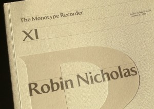
Fifteen years after the centenary Monotype Recorder (published in time for the ATYpI 1997 conference in Reading) the title was revived, this time to celebrate the four-decade long career of Robin Nicholas. There were copies available at the shop of the Pencil to Pixel exhibition, but they have not yet circulated worldwide. This text was my contribution.


Forty years is a long time, by any measure. In typography and typeface design, the last forty years are aeons, encompassing tectonic shifts in the industry. From stable, verdant summers to tumultuous storms and heavy winters, to hesitant then blooming springs, the type industry has seen more change and upheaval in the last few decades than in its previous centuries combined. We know of large companies that ceased to exist, others that transformed into very different entities, and of new ones – small and sometimes getting larger – that are growing into a new environment. And yet, the core principles of typeface design somehow persist, mutate, adapt, and survive the changes.

The company that Robin Nicholas joined is probably the most interesting, and certainly the most persistent survivor. At the time of his joining Monotype as a young draftsman, the industrial behemoth smelting heavy but precise machinery for dispatch to a global market must have seemed like a mountain of granite, immovable through the scale of its commerce and the confidence of its technology. Indeed, expanding his letter-making skills from two to three dimensions in his first years pointed to techniques handed down to apprentices for centuries before his time. And yet, before long, accelerating changes started introducing new ideas in typemaking. The swishes and squirts of pumps gave way to the clicks of flashing lights, and soon after just the hums of cooling fans and the low buzz of electronic devices. The process of making letters lost a dimension: from drawings to ink, the miniscule ridges and valleys of carefully cast metal gave their place to letters cut out of light (more changes were yet to come). New collaborators brought very different skillsets into typemaking, to be replaced in their turn by a dispersed, localised, and by comparison chaotic community. This story is often told, and well-known by all typeface designers and typographers, and we do not need to dwell on the details. Yet, it is only marginally a story of typeface design: it is one of typesetting, of documents in front of readers’ eyes. These documents responded to the seismic industrial upheaval by filtering typography through the new technologies: a great part of their conventions survived, at the level of the letter, the word, and the paragraph. Many more changed, most visibly in layout, and document structure. Primarily, and from our point of view, the technological shifts have been a story of ideas about typefaces surviving across technologies, like a vessel floating from a river to an estuary to an open sea.

Robin’s career has almost entirely coincided with these fundamental transitions in the way typeface designers capture their intentions, and then encode them for production. Precise paper drawings for the letter shapes, specific for each range of sizes, survived across technologies more than people would expect. The delicate pencil outlines captured details in ways that it would take decades for screens to match, even if they gradually lost a lot of the formality of their earlier years (for a brief period of time making beautiful rubylith transparencies the apogee of flat encoding: in many ways, the most pristine form that letters have ever been stored). Downstream of the sheets of paper, however, the story is very different. Once drawings could be stored on a computer, it is not just the direct relationship to the rendered sizes that is missing (away from a punchcutter’s desk, this was never really present).
Letter shapes stored as digital constructs abstracts them from a rendered reality, and makes the drawn letters only a beginning in a process of shape manipulation on a scale that twisting lenses or rheostats could not begin to hint at.

These transitions placed unique challenges for a designer whose career spanned such changes. Superficially, the designer would participate in changing the ways of doing things: new units of measurement, new equipment down the line, new production processes. More visibly, a new class of professionals joined the companies, with a language for describing the making and rendering of letters that would seem alien only a couple of decades in the past. But fundamentally, the changes in typesetting technologies forced a reflection on the key skills of a typeface designer. At the beginning of Robin’s career it would be easy to assume that the typeface designer was inseparable from the making of pencil renderings on paper. The only distinction one could make would be between the degrees of seniority (a draftsman, a designer, the Head of the Drawing Office), to which different levels of privilege for making changes would be assigned. But from when the locus of the designer’s decisions became fluid and transferable across type-making technologies, the contribution of the designer needed to be more carefully articulated. A – not at all rhetorical – ‘what is it that I am really adding to this process?’ has been central to deliberations on typeface design from the mid-sixties onwards (neatly overlapping with Robin’s career). The loss of directness makes this a critical reflection: letters are not anymore perceptible in any approximation of their true form as they travel though each process, but only witnessed indirectly though human-friendly compromises – as every digital technology demands.

Faced with this question, the typeface designer will invariably return to the fundamentals that survive the technological shifts: the designer’s craft involves decisions about typographic patterns and shape details at a level abstracted from the encoding of the shapes, and the mechanisms of rendering. In other words, the designer imagines an idealised visual and intellectual experience by the reader that is derived from a particular typeface, and will strive to make this a reality through – and around – the technology at hand. Robin’s work offers some particularly good examples of this three-way dialogue between the designer, the ideal model of a typeface, and the technology used to capture it, none more so than the revivals of historical types. Is a true Bell, a Centaur, a Fournier, a Janson, a Van Dijk, a Walbaum one closest to the imprint of metal types in the sources – and, of those types, which? In these we see a masterly distillation of a whole range of possible appearances into a definitive set of shapes that have defined typographic reference points. Such digital classics defined not only mainstream textures for typographers and readers, but also an indirect basis for the digital explorations of the 1990s, which found a voice by negating the refreshed historical models. And the approach to the chameleon that is Dante, and the revisitation of Bembo in Bembo Book, show an exceptionally delicate adaptation of style to the digital medium. (Although we must admit that not even Robin’s skills can help the historical accident that is Pastonchi…)

Next to revivals, the other big challenge for typeface designers is a very tight brief for a text-intensive design, of which none more so than newspaper typefaces. These must meet extremely high functional parameters, in tight spaces and with requirements of economy and stylistic discretion that make the achievement of a distinguishing identity the typographic equivalent of hitting a bullseye blindfolded. Yet, the longevity of Nimrod, whose combination of gently swelling terminals and deep arches on the x-height, with an light, strong baseline set a much imitated pattern: directly in new designs even thirty years later, but also in hints that when applied to Scotch Romans updated a style that is one of the dominant styles for text typography to this day. The same pedigree of absolute control of a dense texture (and a familiar clarity in the horizontal alignments) can be seen in the more recent Ysobel, which updates the style with a more self-indulgent italic. Ysobel’s italic is not only a response to rendering improvements in news presses since Nimrod, but also an endorsement of the contemporary rediscovery of the potential of italics in text typefaces, and the gradual abandonment of historical models for the secondary styles.

Whereas revivals and text-intensive typefaces are most illuminating of the designer’s skill, Robin’s work with typefaces for branding and OEMs testify to a side of his work that is not possible to list in a type specimen. For those of us that have had the pleasure of working with him, Robin exemplified the quintessential collaborator: he combines mastery with humility, and confidence with a sincere willingness to discuss a design, and share his expertise. At the heart of his approach lie a deep respect for his fellow designers, and constant striving for learning and, in turn, contributing to the discipline. (I remember fondly sitting with Robin over a stack of printouts with an OEM Greek typeface, our discussion taking us from the shapes in front of us to a pile of books and specimens that would help us answer why a particular treatment of a bowl is true to the style and appropriate to the brief, rather than just formally pleasing.)

This combination of openness and respect for the discipline of typeface design points to two key aspects of Robin’s work, not directly related with any shapes he made. First, his nurturing of several designers that worked under his supervision at Monotype. And secondly, his dedicated efforts to support education in typeface design, not least through his involvement with the masters programme at Reading. As an External Examiner, Robin has directly influenced the direction of education in typeface design; as an advocate for the concrete support of promising applicants he has helped change the lives of a small number of people in very real terms.

I am leaving for last an area of Robin’s contribution that perhaps few people outside the company know much about, but has been paramount in supporting an extremely important trend, as well as foreground the unique nature of Monotype. Through his engaged stewardship of the Monotype Archive in Salfords, Robin has enabled numerous researchers in their work in Latin and non-Latin scripts. This has had a critically beneficial effect in the typefaces designed, and – even more importantly – in the documentation that is available to the next generation of researchers and designers. It is no understatement to say that Robin’s support for the integration of archival research into our postgraduate projects is benefiting in fundamental ways the skills of the younger generation of typeface designers from Reading, and, though them, the appreciation of a research-informed approach in the wider typeface design community. (We should note that Robin is far from alone within Monotype in his active support of education and research: the company is highly sensitive to the unique legacy it holds, the real value for contemporary design of the knowledge embedded in its archives, and the benefits of supporting students at a range of levels.) It would be remiss of me to omit Robin’s involvement with the first Knowledge Transfer project between Monotype and the University of Reading. The project, which demonstrated in concrete terms the value of the Archive in Salfords for the development of new typefaces for the Indian market, captured a key moment in the globalisation of typeface design and the shift towards screen-based texts, and, specifically, mobile devices. The project also enabled a marketing narrative of differentiation based on concrete and deep expertise spanning decades; arguably Monotype is the only active company able to make that claim with regard to the support of non-Latin scripts.

I hope that I have done justice, in the limited space here, to Robin’s long and diverse career. I have attempted to paint a picture of a consummate professional, adaptable to the conditions of his industry, reflective about his practice and the fundamentals of his discipline; an enlightened collaborator, keen to share expertise and support the growth of a younger generation of professionals; and – crucially – a Type Director with a clear vision about protecting and promoting the unique legacy of a very special company, actively engaging with research and education in ways that influence the future of the discipline. For all these, typeface design owes Robin Nicholas a debt of gratitude.

Monotype Recorder

Type Compass: pointing ahead

This is the text I submitted for the foreword for the Type Compass: charting new routes in typography book by SHS Publishing. It is an interesting publication, combining reference and notebook; perhaps exactly what design students need: inspiration, with space for sketching.

Type Compass


Members of the type world have every reason to be happy. For years we have secretly yearned to be able to mention our discipline without the despondent knowledge that blank stares would follow, without having to play the well-rehearsed tape that explained what typeface design is, and that — yes, imagine that! — some people actually made their living from designing letters.

In recent years we’ve seen a gradual recognition by the general public of typeface design as a discipline in its own right. Thanks to smartphones, ebook readers, internationalised brands, high profile wayfinding projects in cities and transport hubs (and a few journalists with a nose for a good story) fonts and typefaces are now terms suitable for polite conversation. In fact, they downright exciting, since disbelief has been replaced by credulous surprise, and eagerness to discover the ways in which our daily lives are filtered through fonts.
This gradual move of typeface design into the wider stage of public awareness has gone hand-in-hand with a stronger realisation by designers of all disciplines that typeface design matters. With this, come publications, exhibitions, competitions, and events of all scales. At the same time, the development of webfonts is beginning to breach the browser window, arguably the most important area where typographic choices were limited to handling space relationships, and crude font choices were justified on cross-platform predictability and the need to publish text as text, rather than as some poor pixelated simulacrum.

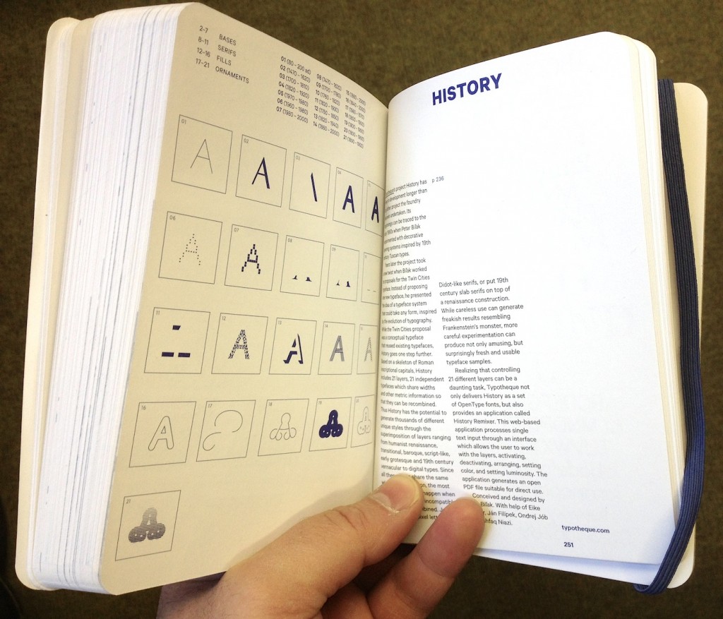
As typographic environments become more refined (the ones that had a lot of catching up to do, that is — because print is doing just fine in this respect) so do our typeface libraries become richer, more varied, and more complex. Richer, because designers continue to invent new ways of making forms, both exploring and abandoning the influences of manual tools (lots of examples of both in this book; notably, Typotheque’s History project manages to do both at the same time). More varied, because a good number of experienced and upcoming designers are publishing new fonts, raising the number of well-designed typefaces higher than it has ever been. And more complex, because typefaces now come in many weights ands styles, offering a degree of refinement in document design that until some years ago only few typographers could hope to expect from retail fonts.

At the same time, typeface design is maturing as a discipline of study and research. There are targeted modules within Bachelor-level courses, and a growing number of dedicated postgraduate programmes in many countries — some in parts of the world where typeface design itself is a very recent area of activity. Many graduates from these courses manage to leapfrog self-educated contemporaries, to found solid careers that pay the rent: this is overdue in typeface design, but the normal state of affairs in pretty much any established professional discipline. And as we acknowledge the elephant in the room, that typeface design is, more than most design disciplines, informed by past practice and context, so does research flourish. This is emphasised by the expansion of design briefs to cover many world scripts as a matter of course: pan-European Latin with Cyrillic and Greek to begin with, and many combinations of Arabic, Hebrew, Indian and Asian scripts. To meet these demands, designers do more research of their own, and make use of other research, to keep expanding their skills.
But the proliferation of typefaces and the texts that accompany them place a new burden on designers: it is now impossible for one person to keep abreast of developments. Typeface design is global, and the scale of output is similarly overwhelming. Publications about typeface design have similarly had to shift their focus. Many publications in the hot-metal and photo-typesetting eras attempted to show all the typefaces in circulation (or, at least, all the ones that mattered). This approach spilled into the early digital period, but is long now abandoned. Instead, publications can let online retailers to function as catalogues of nearly everything, and focus instead on editorship. The selection of work becomes more interesting than the volume; the editor’s perspective more illuminating than any message the inclusion or exclusion of a single work can get across.

This process opens up the space for editors to give each publication a specific depth of field, to borrow a photographic metaphor. From typefaces shown on their own, worthy of study in their own right, to texts in books, on screens, on street signs, where typefaces become enabling tools for other designers, the editor is very much not a silent partner. In putting Eric Olson’s Seravek (a quintessentially contemporary design that manages to be an accomplished all-rounder at the same time) next to Pierre di Sciullo’s inspired T for the Nice tram service, this book makes a robust case for the healthy invention and originality suffusing typeface design, while reinforcing the ubiquity of manufactured and rendered letterforms surrounding us. In this sense, a book such as this becomes a starting point: for inspiration, argument, and another round of informed selection: as good a send-off as any editor could hope for.


You need an opinion, on top of an impulse.

A short while ago James Edgar of the Camberwell Press asked me to write a short text in response to one of four conversations recorded for Whatever next: a discourse on typography. Fraser Muggeridge liked it, so I thought I’d put my final draft here. Blame him if you don’t.


Whatever next: a discourse on typography

Typeface design has arrived. Emerging from the adolescence of an esoteric field absent from wider narratives of culture, it is maturing into an equally esoteric domain; there, gradually increasing numbers of experts witness an explosion of awareness by the wider population, where words like ‘typeface’ and ‘fonts’ will not cause a conversation to freeze.

I am not exaggerating. We are witnessing a celebrated revival in letterpress; the publication of popular books for those who are beginning to notice fonts on their menus; a growing number of serious magazines and larger publications on type; the transformation of texts on screen with webfonts; and the development of massive typeface families spanning several scripts, for branding and pretty much any device that displays text.

This ambiguous state of hesitantly enthusiastic acknowledgement in the periphery of the mainstream is forcing typeface designers, typographers, and educators to clarify our ideas about our disciplines, and the language we use to describe our contribution (as well as fill out the ‘description of work’ in the next invoice). This is less easy than it sounds: typeface design is a quintessentially interdisciplinary field. The immediate actions of form-making and digital encoding rest on a bedrock of historical and cultural understanding, which is gradually establishing its importance in designers’ minds. Type designers need to have an understanding of writing, be familiar with the developments in the technologies of type-making and typesetting, be aware of how texts are transmitted and shared in each society, and respond to the editorial practices and conventions of each market. Some may even engage with the sprinkling of usability and human perception discourse (although, I would argue, with minimal impact on the quality of their work).

All these caveats may make typeface design appear dry, bereft of the originality in form-making associated with the creative industries. This would be a false interpretation. It is better to put it this way: while the typeface designer needs to be just as creative as the next professional, she also needs to show that history, technology, culture, and society are peering over her head as she sketches or nudges outlines. Indeed, it is exactly this increased expectation of knowledge and understanding that separates typeface design from most disciplines in the creative sector.

This issue is reflected in the discussion in the following pages, as is the imperative to distinguish between ‘typeface design’ and ‘typography’. Indeed, it is not difficult to come up with simple definitions: whereas typeface design refers to the design, testing, and production of useable typeforms in whatever appropriate technology, typography relates to the determination of structure and the specification of appearance at the document level. The scale of perspective is quite different: the typeface designer works at the very limit of shape perception, managing patterns of visual recognition more that individual shapes; and the typographer looks at a the complete document, or even a whole class of documents (in the case of series design, and periodical publications). Furthermore, the relationship of the two disciplines to the content is very different. The typographer reliably knows what texts she is giving form to: the semantic content, style of language, length of text, and density of image support, all are known. On the other hand, the typeface designer can only speculate on the texts her typefaces will transmit, or even the most basic typographic parameters. Ironically, the typographer of periodicals, working with templates to provide for a wide set of possible configurations, may be closer to understanding the exercises in abstraction required in developing a typeface. Reflecting on the work of some of the contributors here, we could even argue that the designer of one-off publications like art catalogues may be closer to a lettering artist than a typeface designer.

And, yet, it would be wrong to take the distinctions too far. Both disciplines can be approached along four axes: at the outset is a brief. (Not just ‘clients’: they may approach the designer with a project, but this must translated into a coherent description of requirements and design parameters. The more experienced the designer, the more she may be expected to contribute to the brief.) Second, is the understanding of the functional aspects of the job, as they arise from a consideration of all those who have a stake in the design. This is user-centred design at its most fundamental: ‘does it work for its intended users, for what it was supposed to do?’ Thirdly, both typeface designers and typographers develop identities: there is a potentially infinite combination of design decisions that deliver a strictly functional product, but which capture the broader semantics? Does the typeface (or the document) acknowledge its genre, and does it reflect its time and place? Does it capture the values inherent in the client’s identity, and explore the potential of stylistic and cultural associations? It is this third dimension that gives a design project relevance and value: the ability of the designer to amplify meaning beyond the functional specifications of the brief, into something wider that engages with peers, and the wider community.

The last axis is the designer herself: the form-giver not just as a social observer, but a social commentator. Moving beyond functionality and usability, the designer employs association, style, identity, differentiation, and beauty to reflect a cultural moment back to its members, and express new ways of looking at ourselves. The most successful designers are the ones who gradually (or, sometimes, abruptly) push the envelope of what we consider acceptable, and reveal to us the patterns of our behaviour.

In these respects, both typeface designers and typographers are equal, and unique: different from the lighter domain of graphic design and many applied arts, exactly because their tasks involve strict functional requirements and a deeper knowledge of their domain. And, still, different from the specificity of the engineering disciplines they may employ: because the real value of typographic work lies in its reading of, and response to, social conditions in a transparent dialogue with peers. The idea of typeface designers and typographers as social scientists may be unfamiliar, but one that we may need to get used to.

In search of the digital Cresci (1999)

The text below is a pre-publication version of an article that appeared in Information Design Journal, in 2000. Although somewhat dated, it is useful for typeface design students. It picks up references from a cluster of texts from four issues of Visible Language that form part of the sources for one of the seminars in the MATD and MA (Res) TD:

Donald E Knuth, ‘The concept of a Meta-Font.’ In vol XVI, no 1, 1982

Douglas R Hofstadter, ‘Metafont, metamathematics, and metaphysics.’ And:
[various] ‘Other replies to Donald E Knuth’s article, “The concept of a MetaFont”.’ In vol XVI, no 4, 1982

Sampson, Geoffrey, ‘Is Roman type an open-ended system? A response to Douglas Hofstadter.’ And:
Douglas R Hofstadter, ‘A reply from Douglas Hostadter.’ In vol XVII, no 4, 1983

Donald E Knuth, ‘Lessons learned from Metafont.’ In vol XIX, no 1, 1985


**********************

No review of digital typography is complete without a long stopover in Don Knuth’s neighbourhood. A mathematician based in Stanford, California, Knuth is primarily active in the field of computer programming. During the mid-1970s, out of frustration with the quality of phototypeset mathematics, Knuth was driven to address the problem of at least matching the standard of hot-metal Monotype output. [1. Knuth’s first two volumes of The art of computer programming (Reading, MA: Addison-Wesley, 1968 and 1969 respectively) were typeset on Monotype machines. A good source on the standard achievable by hot-metal composition is the winter 1956 issue of the Monotype Recorder (vol. 40, no. 4), which was devoted to the setting of mathematics with the Monotype 4-line system.] The product of this endeavour was Tex, a versatile and powerful typesetting system which outputs device-independent documents. Alongside Tex, Knuth developed Metafont, [2. Knuth typesets Tex and Metafont as TEX and METAFONT respectively through-out the book. Here the words are treated as software titles, not logotypes.] a system for generating typeforms. (The term “typeform” is used to signify the rendering of a typographic character, therefore a mark intended to function in conjunction with other marks with which it forms a collection (normally a typeface), without prior knowledge of the context of its use. On the other hand, a letterform is a one-off mark produced for a particular context, e.g. a manuscript or a piece of calligraphy.) From early on Knuth made both systems freely available, and it is not an overstatement to say that Tex has transformed the production of scientific writing. Tex users number in the tens (if not the hundreds) of thousands, and it will be a rare math-intensive paper that is not so typeset.

Digital typography, published in 1999, is the third in a planned series of eight books of Knuth’s published works, together with some new material. It is a hefty 680 pages, comprising 34 papers and articles, including the transcripts from three relatively recent question & answer sessions. The majority of the contents has been previously published in TUGboat, the journal of the Tex Users Group. Knuth has already begun the process of identifying errata; characteristically, readers who contribute can look forward to a reward of $2.56. (The list is updated at Knuth’s Stanford page.) To his credit, not only is the prose very readable, but the mathematical exposition managed to flatter this reader that half-forgotten business studies algebra was up to the task of digesting the arguments. However, for reviews on the programming content, and opinions on literate programming (an area of Knuth’s activity to which he attaches great importance), readers are advised to turn to TUGboat vol 20, No 2, 1999: its editor has announced reviews by Knuth’s fellow computer scientists.

At one level, the book is an archival collation of technical papers and notes; at another, it is a source of pertinent ideas and fascinating suggestions – especially so when addressing the nature of letters and typeforms. Inevitably, the more technical chapters will make non-specialists feel they are eavesdropping on a conversation having missed the key remark. Even so, reading the early projections back-to-back with the mature re-evaluations (mostly through the question & answer transcripts) sheds a revealing light on the development of a significant body of work.

The papers fall in two broad categories, Tex and Metafont, with a few further items on rasterization. Of the two main themes, Tex is the more significant, if less interesting – a corollary of its undisputed status: the value of Knuth’s contribution to electronic typesetting is as significant as the superiority of Tex’s line-breaking algorithms over pretty much anything else available now, let alone twenty years ago. Indeed, it is only this year, with the launch of Adobe’s InDesign that we get a ‘multi-line composer’ – a line-breaking algorithm that monitors several lines before fixing line-breaks. Adobe properly acknowledge the credit, [3. See ‘Adobe InDesign in depth: text and typography’ pp. 3–4, 8.6.99. Adobe’s description of InDesign’s ‘multi-line composer’ is impressively close to Tex, and they even use the term ‘badness’ (a Tex trademark) in their documentation.] but, at the time of writing, it remains to be seen whether InDesign can match the typographic texture Tex can achieve.

Tex is based on the twin concept of approaching documents as lists of boxes joined by stretchable ‘glue’, and defining values of ‘badness’ for deviations from optimal spacing values. Knuth repeatedly mentions that the potential of these simple premises was not fully foreseen. Indeed, a non-Texpert looking at the typesetting complexity of material produced with Tex cannot but admire the elegance and economy of the concept. In this respect Digital Typography is a showcase item – and if the typesetting of the mathematical matter is more obviously impressive, the evenness of the texture in less extravagant pages sets a subtle benchmark. (The only gripe in this department being a propensity for too-wide, almost double, spaces after full stops – an annoyingly persistent legacy of typists, which is avoidable in Tex.) Indeed, the combination of quality printing on good paper and the effectiveness of Tex is enough to render the singularly unattractive Computer Modern typeface used for most of the book digestible, by any standards no mean feat.

By far the more interesting parts of the book are the chapters on the inception, development, and use of Metafont. Particularly enjoyable for documenting the evolution of a design is the chapter on AMS Euler, a typeface family for mathematical typesetting that Knuth developed in association with Hermann Zapf for the American Mathematical Society. [4. One cannot help but think that Zapf, probably the best known representative of the calligrapher-as-type-designer approach, was the ideal choice for a meta-collaborator: Zapf’s technique lends itself readily to interpretation in the Meta-font idiom. It is tempting to speculate on developments had Knuth collaborated so closely with a type designer from a punchcutting or drafting background. It is, however, interesting to compare other documented uses of Metafont for large projects (see, for example: Southall, Richard, ‘Metafont in the Rockies: the Colorado typemaking project.’ In Roger D. Hersch et al (eds.), Electronic publishing, artistic imaging and digital typography. Berlin: Springer Verlag, 1998, pp. 167–180, where the emphasis was on control of the rasterized output).] Predictably, work on Metafont started as an attempt to address the practical problem of supplying typefaces for Tex – remember, this is long before the days of PostScript and TrueType, and digital typefaces suitable for mathematical typesetting were thin on the ground. Knuth’s original goal was ‘to find a purely mathematical way to define the letter shapes and to construct the corresponding raster patterns’. [5. Digital typography, p. 35] This statement can be something of a Pandora’s box, depending on whether one interprets ‘to define letter shapes’ to mean: ‘to codify an explicit description of a typeform (or a group of typeforms)’ – or: ‘to specify a process for the generation of new typeforms’. Throughout the book, one gets the impression that Metafont does the one thing, and its creator thinks (sometimes, at least) that it can do the latter, as if Knuth saw in Metafont more than the technology implied. In Digital Typography he recounts how he studied letterforms and saw regularities in the design, from which he realised that he ‘shouldn’t just try to copy the letterforms, but [he] should somehow try to capture the intelligence, the logic behind those letterforms’. [6. Digital typography, p. 607] One cannot but think that, at some point, Knuth must have made a mental leap from devising a description system for typeface families to a broader generic system for typeform description and generation. Perhaps it was his enthusiasm for letterforms that led him to such statements. In any case, this quote raises two fundamental questions: given that there is some ‘intelligence’ behind typeforms, is it possible to make it explicit? And, secondly, assuming that it is so, is it possible to codify this ‘intelligence’ in mathematical terms?

In any case, Knuth seems to have been aiming at a new approach for designing a typeface family, an approach that could ensure consistency in the design of various, not necessarily predetermined, weights and styles. (A goal that Adobe’s Multiple Master fonts have also sought to address – bar the ‘not necessarily predetermined’ bit.) The first version of the system, Metafont 79, defined ‘pens’ and ‘erasers’, and prescribed the trajectories between co-ordinates in two dimensions that these pens (or erasers) would have to execute in order to render each typeform. The dimensions and behaviours of pens and points were parameters definable by the user. A particular Metafont would be a collection of a finite set of parametric mark-makers and behaviours, each parameter assuming one of a potential infinity of values. In other words, using a single ‘master description’ infinite variations on a theme could be output. Key to this point is the fact that there exists not a singular, explicit collection of typeforms from which variations are extrapolated; rather, the specified parameters define a ‘design space’ within which any instance is equally valid as the next one. In essence Metafont-the-application is a system for the description of categories of typeforms; each Metafont-family is a classification system with a fixed number of ‘pigeonholes’ of infinite depth; each Metafont-typeface the compilation of a selection from each pigeonhole.

Knuth’s scientism was presented as the most recent chapter in the book that started with Felice Feliciano in the 1460s, continued with Damiano da Moyle, Fra Luca de Pacioli, and nearly twenty others, to reach a spectacular highpoint around 1700 in the engravings supervised by Phillipe Grandjean. Almost with no exception, these attempts at instructing on the ‘correct’ or ‘proper’ formation of letterforms (mainly capitals) were no more than fascinating red herrings of rationalisation. The most important exception to this trend was the Milanese scribe Giovanni Francesco Cresci, who pointed out the futility of his contemporaries’ propositions – and is in fact quoted in Digital Typography. But Knuth then does an about-face and writes: ‘Well, Cresci was right. But fortunately there have been a few advances in mathematics during the last 400 years, and we now have some other tricks up our sleeves beyond straight lines and circles. In fact, it is now possible to prescribe formulas that match the nuances of the best type designers’. [7. Digital typography, pp. 38–39] This remark can be interpreted as either ‘we can codify an existing design without any information loss’ (which is perfectly acceptable), or ‘it is possible to specify algorithms for the creation of letterforms’ – we should add the caveat: to Cresci’s standard. Neither of these interpretations is a correct description of Metafont, but the latter is closer to Knuth’s writing about it.

Metafont is a tool for creating typeforms in the same way that a chisel is for creating letterforms. A meta-designer will approach the computer with more or less pre-formed intentions about the general style of typeforms, if not a wholly clear notion of a specific instance of the Metafont he will be defining. He would then have to mentally translate his intentions into the Metafont grammar of pens, erasers, trajectories, and edges, and enter the appropriate code. And, as with all similar activities, we can expect the designer to undertake several proof-and-revision cycles until the result is deemed satisfactory. The meta-designer uses a computer to facilitate the expression in a usable format of a pre-conceived set of typeforms, in the same way as someone using Fontographer or FontLab: the concept of a typeform is visualised internally, then translated into a formal grammar understood by a tool, then entered in the tool’s memory for processing. For sure, as with all tools, Metafont will in some way affect this ‘double translation’ of the designer’s intentions. But to claim that Metafont aims in ‘the explicit implementation of the design ideas in a computer system’ [8. Bigelow, Charles, [contribution to] ‘Other replies to Donald E. Knuth’s article, “The concept of a Meta-Font”.’ In Visible Language, vol. XVI, no. 4, 1982, p. 342] misses the point that Metafont simply implements the product of the design ideas in a specific medium. What results from meta-designing is nothing more than the final trace of the process, not in any way a representation of the design process itself – let alone the ideas that generated it. Ultimately Metafont rests on two flawed assumptions: one, that by studying the finished product of designers’ work we could understand what was going through their minds, and isolate these intentions from the effects of their tools; and, two, that we could then express the range of these intentions in code for a computer ‘to carry out the same ideas. Instead of merely copying the form of the letters, […] to copy the intelligence underlying the form’. [9. Digital typography, p. 8]

What is important in type design? Type designers would say: patterns, relationships, the interplay of negative space and positive mass. A designer may intellectualise the design process ex post facto, but it is highly questionable that this process can be made explicit before the design is complete – indeed, it is safe to assume that it is largely crystallised during designing. To seek to represent the internal process of designing as the making of marks is to mistake a procedure for its motive.
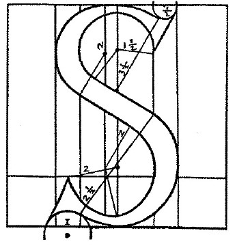
Given that a considerable part of Knuth’s research was based on manuscript books and fine printing (that would, most probably, make use of oldstyle typefaces), it was perhaps not unexpected for him to adopt a model that replicated the rendering of calligraphic letterforms. However, the fluidity and potential for optical balance in formal calligraphy does not survive in Metafont. It is indicative that, in the process of refining the mathematical description of an ‘S’, Knuth chose Francesco Tornielo’s geometric description from 1517. Tornielo’s essay was one more entry to the list of the Renaissance geometric fallacies that started with Feliciano – one could add that Tornielo’s were among the less beautiful letterforms. Knuth follows and amplifies Torniello’s instructions, then ‘solves’ the problem of a mathematically correct representation of the ‘S’. However, even though the meta-S is far more detailed and flexible than Tornielo’s, it does not hold any information on what makes a good ‘S’.
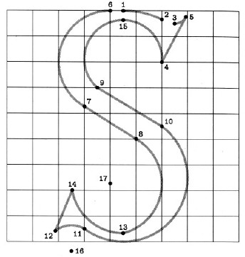
Translation of Tornielo's instructions in Metafont

It could be argued that a procedural model that replicates an existing, non-computer-based activity does little justice to the potential of computers as design tools. A computer application for designing typeforms is unconstrained by lettering procedures. Shouldn’t this liberation suggest a new design paradigm? In its ductal rationale Metafont is suggestive of a digital version of Gerrit Noordzij’s scheme for description and classification of typeforms according to the translation and expansion of a rendering nib. [10. Noordzij, Gerrit, The stroke of the pen: fundamental aspects of western writing. The Hague, 1982. (A somewhat expanded version of this paper was published under the title ‘Typeface classification’ in the first volume of Bernd Holthusen & Albert-Jan Pool, Scangraphic digital type collection (edition 4). Mannesmann Scangraphic, 1990, pp 65–81)] But Noordzij has his feet firmly planted in the western lettering tradition, and approaches typeforms as inextricably linked to this background. Significantly, his analysis is exegetical, and not intended as a tool for the generation or manipulation of new typefaces. Furthermore, Noordzij acknowledges the presence of exceptions outside the possible design space (the ‘typographic universe’) of his system. This internal consistency is not obvious in Metafont’s approach, in which analysis of one idiom is presented as a tool for describing typeforms of any pedigree. In other words, Knuth adopted an idiom that seems foreign to his tools. Admittedly, the significantly redesigned Metafont 84 made provision for the definition of typeform edges, but Knuth still believed that the pen metaphor ‘gives the correct “first order” insights about how letters are drawn; the edge details are important second-order corrections that refine the designs, but they should not distract us from the chief characteristics of the forms’. [11. Digital typography p. 330]

For a type designer from a non-calligraphic background the ‘moving pen’ paradigm will probably limit the formal freedom of defining typeforms on a virtual plane. The designer will have to translate the contours and patterns in his mind to the grammar of Metafont, a process which is counter-intuitive – not to mention the possibility of the intended forms being unreasonably difficult to convert into Metafont. Moreover, type designers do not generally think in nebulous trends (‘some sort of serif about here’ or ‘a bit of a notch around there’) – they tend to approach new designs with a set of curves or patterns, in positive or negative space, that they then develop to construct the whole of the typeface. In this respect the flexibility afforded by Metafont in creating new designs is of debatable benefit.

Instances of the same meta-S

This issue highlights a common denominator in discussions of digital type: the relationship between the designer’s intentions and the typeforms that are finally rendered is not fixed. The designer will record disembodied – perhaps idealised? – typeforms as they would render under hypothetical, ‘perfect’ conditions, then edit the font data or enrich it with information to make the typeforms render as faithfully to the original intention as the technology allows. It is arguable that, to some extent, a similar process existed in all typeform-making technologies. However, currently available type design software depends heavily on this dissociation of intended and realised typeform. PostScript Type 1 fonts are the best example of this: dependence on a system- or printer-resident rasterizer for rendering means that as the rasterizer is upgraded the same font information may generate different output. In TrueType fonts rasterizing is primarily controlled by information in the font file itself, but the process of specifying this information is quite distinct from the design of the outlines.  Metafont is exceptional in that the typeforms generated from the user’s definitions of [groups of] typeforms are inextricably linked to the resolution of the output device. ‘Pens’ are digitised to the appropriate raster before rendering the typeforms. It is also possible for the user to define explicitly the raster frequency, as pixels-per-point or per-millimetre. In other words, the ‘enrichment’ is not a separate stage in font design and production, but an integral aspect of working with Metafont. It might well be that in this respect Metafont’s approach is truer to the digital world – or not?

{{work:4_dekmetafonts.jpg|The middle S in the sequence of the previous illustration with defining points highlighted. Notice the white regions in the counters, where “erasing” has been specified}}

There is another argument against Knuth’s scientism: Metafont fails the typographic equivalent of the Turing Test.  He asserts that ‘Metafont programs can be used to communicate knowledge about type design, just as recipes convey the expertise of a chef’. I would argue that neither is the case, but I am not a professional cook. To stick to the culinary analogy, however, Metafont can be seen as one of those multi-function tools that chop, grate, slice, and generally do faster and in some cases better all sorts of things that you could do by hand – but it does not join you at the table when the dinner is ready. Can we supply a computer-literate person with the Metafont-programs for a typeface family, and in any way expect them to develop an understanding of the original designer’s concepts for the design?

Indeed it was a designer and educator with far more experience than this writer that interpreted Metafont as implying that ‘the parameters of a design are more important than the design itself – that is: than the idea behind the design and how the face looks and reads’.  Here our attention is pointed to a fact that Knuth seems to overlook: typeforms are social animals. Type designers must marry their personal (culturally coloured) viewpoint with their speculations on the reception of their typeforms within their environment. Furthermore, it does not follow that the eventual interpretation of the typeforms will be the anticipated one. This cycle inevitably informs the design process. The changing appreciation of designs through time is witness to how the same typeform – the same procedure – can elicit different interpretations. (Does Akzidenz Grotesk carry the same connotations today as it did at the turn of the century?) Conversely, if the environment within which a typeform is created is foreign to us, Metafont’s ‘capture of the intelligence behind the design’ will not reveal the designer’s intentions. (If a contemporary designer works in a script we are not familiar with, could the Metafont files offer insight into which parts of typeforms were essential elements, and which were embellishments?) Since the computer operates in a social vacuum, it cannot understand what it’s doing. Not only is Metafont merely replicating a procedure, but its product is meaningless within the computer’s frame of reference: Metafont cannot judge whether the typeforms it generates are acceptable in the type designer’s environment. In other words, it is possible that an instance of a meta-typeface is valid within the Metafont-system (indeed, assuming a debugged program, it would not be produced were it not so), but not acceptable in the social context.


Now the reasoning behind the caveat about generating letterforms ‘to Cresci’s standard’ becomes obvious: the qualitative sufficiency of the outcome is not guaranteed by the otherwise valid implementation of a Metafont. Knuth has forgotten his brief recognition that Cresci had got it right. Like a true descendant of the 15th century deterministic letterers so enamoured of the ruler and compass, he defines a formula for determining the optimal curvature at a given point along a typeform. But what he comes up with is, inevitably, his own interpretation of a ‘most pleasing curve’. Clearly, each type designer has his own inner set of ‘most pleasing curves’, proportions, and patterns that he returns to in each design. It could probably be argued that the mathematical expression of curves constrains the range of possible ‘most pleasing’ curves for each circumstance. (W. A. Dwiggins might have had something to add to this. While he was satisfied with the Mergenthaler draftsmen’s transfer of his own drawings to blueprints for pattern-making, he did comment on the over-regularised Legibility Group typefaces. In copying Dwiggins’ drawings the draftsmen were only using their french curves to follow patterns that had been designed according to one person’s vision. On the other hand, the Legibility Group typefaces were designed in-house, and – despite C. H. Griffith’s supervision – were a collective effort. It is not difficult to imagine that in such an environment french curves would suggest patterns, instead of just follow them.)

The subjectivity of what constitutes a ‘most pleasing curve’ is borne witness by the variety of opinions on any type design. Despite any generalisations we may care to make, the optical compensation of shapes so that they look and feel correct, rather than actually measure so according to a geometric rule, is very much up to the designer’s judgement (and retina). It is this subjectivity which demands that every type designer goes through long printing out, looking at, editing, and starting-all-over-again sessions. It is the presence of these internal, deeply subjective ‘french curves’ that gives rise to the re-visitation by many designers of similar themes across quite different typefaces. In this respect, by drawing on existing cultural patterns and expanding on them to create new, personal interpretations, is it an exaggeration to compare typeface design to composing a piece of music, a case for type design as jazz?

When Knuth’s concepts first reached a wider, typographically-minded, audience the debate generated arguments that still resonate. At its best, Digital Typography is a source of provocative inspiration, an opportunity for debate that should not be missed. Its challenges should be heartily taken on by typographers, type designers, and educators alike. We may disagree with Knuth’s adherence to Tornielo’s ways, but his thoughts have brought us that little bit closer to our search for a Cresci for the digital age.

‘In search of the digital Cresci: some thoughts on Don Knuth’s Digital Typography‘. Stanford, CA: CSLI Publications, 1999. In Information Design Journal, vol 9, no 2 & 3, 2000, pp 111–118
Languages, scripts, and typefaces (2006)

[Response published in tipoGrafica no 70 (2006)

Do you consider that new technologies will enable those languages that have historically not been represented in font design, to incorporate the sounds appropriate to their tongues?

Hm… the question is somewhat misleading. The ‘languages that have historically not been represented in font design’ bit suggests that typeface designers who are native users of the other languages, the ones that have ‘historically not been represented in font design”, designed their typefaces with the sounds of their language in mind. This is not the same as saying ‘I can hear the words when I read’ or something like that; it means that the designer would have specific sounds in mind when designing a particular glyph. I’m pretty certain this is not the case; even more, I think the hypothesis runs counter to the basic mechanics of natural scripts.

Are fonts developed for specific languages? Even in the old days of 8-bit codepages, when each font file could take up to 256 characters, any single font allowed many languages to be typeset; the same font would do for English, Spanish, French, Finnish, and Italian, just as the same font with the declaration ‘CE’ following its name would cover Croatian, Czech, Estonian, Hungarian, Latvian, Lithuanian, Polish, Romanian, Latin-based Serbian, Slovak, Slovenian and Turkish (I think that’s all).

Such groupings (and there were plenty) were a combination of technical limitations (fitting all the characters in the font file) and commercial expediency: development, distribution, and retail channels. Each of these fonts claimed it could be used to typeset all these languages – and it did, offering a more or less adequate typographic representation of a script’s subset. I am choosing my words carefully here, because the point I am making is that typefaces offer interpretations of scripts, not languages.

We can shed some light on this distinction if we consider another distinction. So far I’ve been using the term ‘character’, but in fact this is not strictly correct. At the heart of contemporary applications and typefaces is the Unicode standard: a system for assigning a unique identifier to each character in any script ever used by humans. In this sense, ‘Latin small letter a’ and ‘Greek small letter alpha’ are characters, but ‘a’ and ‘α’ are not: they are glyphs: typographic representations of characters. In other words, all ‘α’s in all the typefaces in the world are the same character: Greek alphas, and all the ‘a’s are Latin [script] ays (how do you spell ‘a’?) – not English or Spanish or Finnish ays. To put it bluntly: the character implies a specification for the formal configuration of the glyph (relationship of positive and negative spaces) but is ignorant of the specific shape.

The relationship between character and glyph is, in my view, strongly analogous to that of a glyph and its voicing within a language. The Latin ‘a’ implies an ‘envelope’ of sounds within each language that is written with the Latin script, and a set of relationships of this sound with neighbouring glyphs. The leeway in speaking the glyph is, however, considerable; even to my unfamiliar ears a word such as ‘tipografia’ sounds very different when spoken by my Argentinian, Mexican, or Spanish students. Should they be writing with different glyphs for the ‘a’ in each language?

If, for the sake of argument, we posited that: yes, each of these three languages requires a different ‘a’ (or a different combination of ‘gr’, for that matter) then we must automatically decide what is the minimum difference in enunciation between the two variants that will trigger a choice one way or the other. Do we document the range of possible sounds that pass for ‘a’ in speech in each of these languages? This can quite quickly turn into a massive exercise in mapping speech patterns and deviations – the age-old classification problem of the infinite pigeonholes, the ‘duck-billed platypus’.

I can almost hear you say: ‘hold on there, you’ve missed the point! We should only be looking at each language in turn, not compare across languages!’ OK; but what will we do with dialects, regional variations, inflections dependant on age, social class, education level, professional affiliations, and the like? Again, this is a dead-end. Should I write English with different glyphs from my children? I have an expat’s accent, forever getting the length of vowels and the strength of consonants wrong; but my children, who go to nursery with all the other children in the area, speak English with an impeccable accent (so much so, they already correct their parents…).

There is only one area where we can strive for a close, one-to-one relationship between spoken sounds and the glyphs of a typeface, and that is the domain of linguists who document spoken language. (The International Phonetic Alphabet is fairly comprehensive in its coverage of sounds the human larynx can produce, and only extended when someone researching vanishing or spoken-only languages come across a new sound.)

Going down that route will take us further away from the visible form of language, and into questions that deflect from and confuse the study of typeface design; this must, by definition, be limited to the representation of characters, not of sounds. The formal qualities of the glyphs may bear many influences, from the direct (mark-making tools such as nibs and brushes) to the lofty (theories of construction); and they will normally take a long time to define a envelope of expression for each time and place (the strength of which is tested each time we come across the ‘design-by-dictat’ approach seen in Korea, Russia, Turkey, and – most recently – in the ex-Soviet states of the Caspian).

So what about the bells and whistles? Current technology promises a range of options that were not available before outside specialised environments. These must be seen as limited to the level of enriching the typographic expression of a script, but not jumping out at the level of the sounds the glyphs will generate in specific users. So, if a Polish typographer prefers diacritics to lie flat over the vowels, whereas a French one may opt for the upright ones, all the better if the font files can provide both, change from one to the other on the fly, and keep both users happy. Similarly, if the Dutch have a mark that looks like an ‘i’ and a ‘j’ close together and are taught at school this is one letter, you would hope that the whole chain of text editors, word processors, spell checkers, dictionaries and thesauri would recognise it as such. Speaking is interpreting sounds within a culturally-sensitive envelope; so is typeface design: defining glyphs within the acceptable spectrum of each character. But the designer cannot interfere where there is not linguistic ground to step on: if it means different things, go ahead and make a new glyph – but if it just sounds different, well, that’s just a reflection of the imprecise, fluid, and constantly mutable nature of human expression.

Let’s stick to mark-making, I say.

Τριτοβάθμια εκπαίδευση γραφιστικής (2010)

Δύο απαντήσεις για την τριτοβάθμια εκπαίδευση στην γραφιστική στην Ελλάδα


Θανάσης Αντωνίου Ποια είναι η εικόνα που έχετε για το συνολικό επίπεδο της ελληνικής επαγγελματικής εκπαίδευσης πάνω στο γραφιστικό σχεδιασμό και ποια είναι η σχέση του με το αντίστοιχο επίπεδο στην αγγλική πανεπιστημιακή εκπαίδευση;

ΓΛ Η εικόνα που έχω για την επαγγελματική εκπαίδευση στο χώρο μας στην Ελλαδα ειναι δειγματολειπτικη και εξ αποστάσεως, συνεπως ελλειπής και αναξιόπιστη. Στο βαθμό που ενδιαφέρει, φαίνεται οτι σε γενικές γραμμές προσανατολίζεται στην κατάρτιση, δηλαδή το χτίσιμο δεξιοτήτων για επαγγελματίες, παρά την εκπαίδευση, δηλαδή την ανάπτυξη μιας ευρύτερης αντίληψης για το χώρο της τυπογραφίας και τη αναμιξη με την έρευνα στο χώρο. Με άλλα λόγια ο σχεδιασμός δεν πρέπει να περιορίζεται στην επίλυση ενός συγκεκριμένου προβλήματος (o σχεδιαστής ως problem-solver) αλλά να επεκτείνεται στην αλληλεπίδραση με το πολιτισμικό πλαίσιο (ο σχεδιαστής ως cultural commentator), και την καινοτομία στο χώρο (o σχεδιαστής ως innovator). Αυτή η εξάπλωση της αντίληψης του επαγγελματία ως παράγοντα που συμμετέχει και πιθανά συνεισφέρει στο γνωστικό χώρο είναι μια εξέλιξη που δε μπορεί να κινητοποιηθεί μέσα από την αγορά εργασίας, παρά από τις διάφορες σχολές. (Η σύγκριση με την αρχιτεκτονική ως χώρο έρευνας, εκπαίδευσης, και επαγελματικής δραστηριοποίησης προσφέρει το πιο πρόσφορο παράδειγμα.)
Θανάσης Αντωνίου Γιατί μέχρι σήμερα η δημόσια εκπαίδευση στη γραφιστική, έτσι όπως ασκείται στο ΤΕΙ της Αθήνας, δεν ΄χει καταφέρει να αποκτήσει εκτόπισμα στην ελληνική αγορά και να αντιμετωπίσει την πρωτοκαθεδρία των ιδιωτικών σχολών; Είναι μόνο ζήτημα χρημάτων; Είναι ζήτημα προσωπικοτήτων- διδασκόντων; Ή έχει να κάνει με τη γενικότερη κακοδαιμονία της εκπαίδευσης στην Ελλάδα;

ΓΛ Δυστυχώς δεν μου έχει δοθεί η ευκαιρία να γνωρίσω το πρόγραμμα των ΤΕΙ απο κοντά, οπότε δε μπορώ να εκφέρω γνώμη. Υπάρχουν όμως κάποιες παράμετροι που ισύχουν γενικότερα, που διαφοροποιούν τη δημόσια από την ιδιωτική εκπαίδευση στο χώρο. Πρώτα από όλα η συνέχεια και η μακροπρόθεσμη προοπτική: ένα δημόσιο πρόγραμμα μπορεί να ενσωματώσει πηγές και εμπειρία ετών, θέτοντας στόχους για την ευρύτερη διαμόρφωση του χώρου (για παράδειγμα την παραγωγή ερευνητών και διδασκόντων της επόμενης γενιάς). Δεύτερον, η επένδυση σε υλικοτεχνική υποδομή (π.χ. εκτυπωτικές μηχανές) και αρχειακό υλικό (π.χ. συλλογές εντύπων και αντικειμένων) που συνεισφέρουν όχι μόνο στην βαθύτερη κατανόηση του αντικειμένου, αλλά και στην ενθάρρυνση της έρευνας στο χώρο, και της αναβάθμισης του γνωστικού χώρου στην ευρύτερη κοινωνία. Τρίτο, η υποστήριξη διδασκόντων με μεγάλο βαθμό απασχόλησης με στόχο την καλλιέργεια αρίστων τεχνικών διδασκαλίας, αλλά και την παραγωγή ερευνητικού έργου. Με άλλα λόγια, η διεθνής εμπειρία δείχνει ότι ενώ τα ιδιωτικά ιδρύματα προσανατολίζονται στην άμεση εξυπηρέτηση της αγοράς, τα δημόσια ιδρύματα έχουν τη δυνατότητα να παράγουν γνώση, και να αναπτύξουν τον γνωστικό πεδίο στο οποίο στηρίζεται η επαγγελματική δραστηριότητα. Τέλος, υπάρχει και ένας ουσιαστικός κίνδυνος από τον οποία νομίζω ότι υποφέρουν τα ΤΕΙ: ενώ το Κράτος πρέπει να χρηματοδοτεί τις σχολές, πέραν τούτου πρέπει απλά να εμπιστεύεται τους ερευνητές και διδάσκοντες να σχηματίσουν οι ίδιοι τα προγράμματα σπουδών με ευελιξία και με ευαισθησία στην εξέλιξη του χώρου, χωρίς άλλη ανάμιξη.